

Membership Page
A subscription-rates page built from your native Ghost tiers — live prices, benefits, free trials and one-click Portal checkout, in two layouts, with no theme settings to fill in.
The Membership page is a full pricing-and-signup page built entirely from your native Ghost tiers. It reads each tier's name, description, monthly and yearly price, benefits and free-trial length straight from Settings → Tiers, formats the prices in your currency, and wires every button to Ghost's Portal checkout.
There are no theme settings to fill in. Set your tiers up in Ghost and the page builds itself, staying in step as you change prices or plans.
It ships in two layouts — a plan comparison and a compact order form — supports free trials, and puts whatever you write in the page body below the plans.
Where it lives
The page is a Ghost page with the URL join, so it lives at /join/. The theme's template binds to that URL automatically; there is nothing to select in the editor. Until you create the page it simply doesn't exist, and every Subscribe button on the site keeps opening the Portal popup.
Set it up
Set your tiers up first. In Ghost Admin open Settings → Tiers and configure your plans. For each paid tier set a name, a short description, the monthly and yearly price, a list of benefits, and, if you want one, a free trial length. The page renders whatever you put here. Connect Stripe under Settings → Membership so paid plans can actually be bought.
Create the page. Add a new page and set its Page URL (in the settings panel) to join. The page title becomes the headline and the Excerpt becomes the line beneath it, so write both for your readers.
Add supporting content (optional). Anything in the page body renders below the plans: an FAQ, a reader quote, a note on where the money goes. See The page body.
Publish. The page goes live at /join/ with your plans, and every Subscribe button across the site starts pointing at it.
Tiers in Ghost Admin
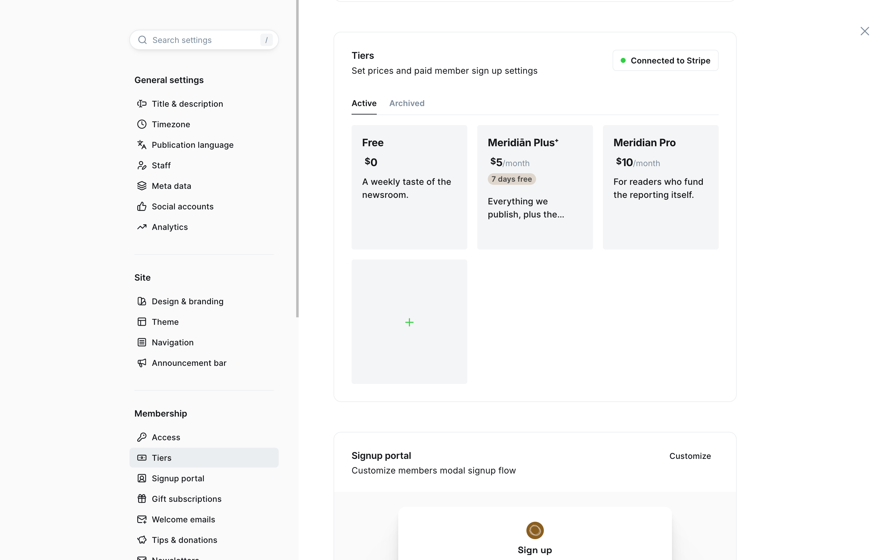
Set the page URL to join
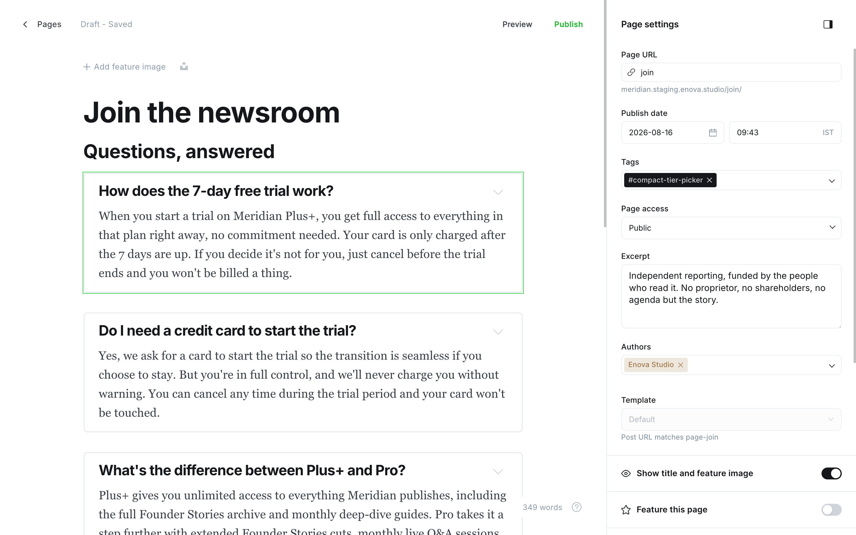
Your tiers drive everything
Change a tier in Settings → Tiers and the page updates on the next load. No pricing copy lives in the theme.
- Prices are formatted in each tier's own currency, and the Monthly / Yearly switch changes every price, every saving and every checkout link at once. Which prices appear at all is up to your Portal settings: see Monthly, yearly or both.
- Benefits are the list under each plan, straight from that tier's Benefits field.
- Descriptions are that tier's Description field.
- "Most popular" is stamped on your lowest-priced paid tier automatically.
- The Free tier always appears. Give it benefits too, so its column isn't empty.
- Checkout hands off to Ghost's Portal for the chosen plan and billing period; Ghost handles the card and the trial.
Paid plans need Stripe connected
Paid tiers only appear when paid memberships are purchasable — members enabled and Stripe connected. Without Stripe the page shows just your Free plan and hides the billing switch, rather than offering a plan nobody can buy. Connect Stripe under Settings → Membership and your paid tiers appear.
Monthly, yearly or both
The page offers exactly the prices Ghost's own signup popup offers. In Ghost Admin open Settings → Membership → Signup portal → Customize, then the Signup options tab, and look at Available prices:
- Monthly and Yearly both ticked: every paid plan shows both prices, with the Monthly / Yearly switch above the plans. The page opens on whichever you choose under Default price at signup, just like the popup does.
- Only Monthly ticked: every paid plan shows its monthly price. There's no switch and no yearly saving line.
- Only Yearly ticked: every paid plan shows its yearly price, as
$50 / year. Again there's no switch. - Neither ticked: the popup sells no paid plans, so the page shows your Free plan on its own.
The checkout buttons follow the same rule, so no reader can start a checkout for a price you've switched off. The membership band above the footer works the same way.
Tiers follow Available tiers on the same tab: untick a tier there and it leaves the page too.
The saving on yearly plans
When a tier's yearly price is genuinely cheaper than twelve monthly payments, the page works out the saving from your own numbers and shows it under that plan's price, as or $50 a year · save 17%.
The line always advertises the other billing period, and it's clickable: a reader viewing monthly prices can tap or $50 a year · save 17% to flip the whole page to yearly, and tap or $5 a month to flip back.
If a yearly price isn't actually cheaper, its line simply doesn't appear: you'll never see "save 0%". The line also needs both prices on offer, since with only one there's nothing to switch to.
Two layouts
The page has two presentations. The default lays your plans out side by side; switch to the compact order form by adding one internal tag to the page.
Default — Plan cards
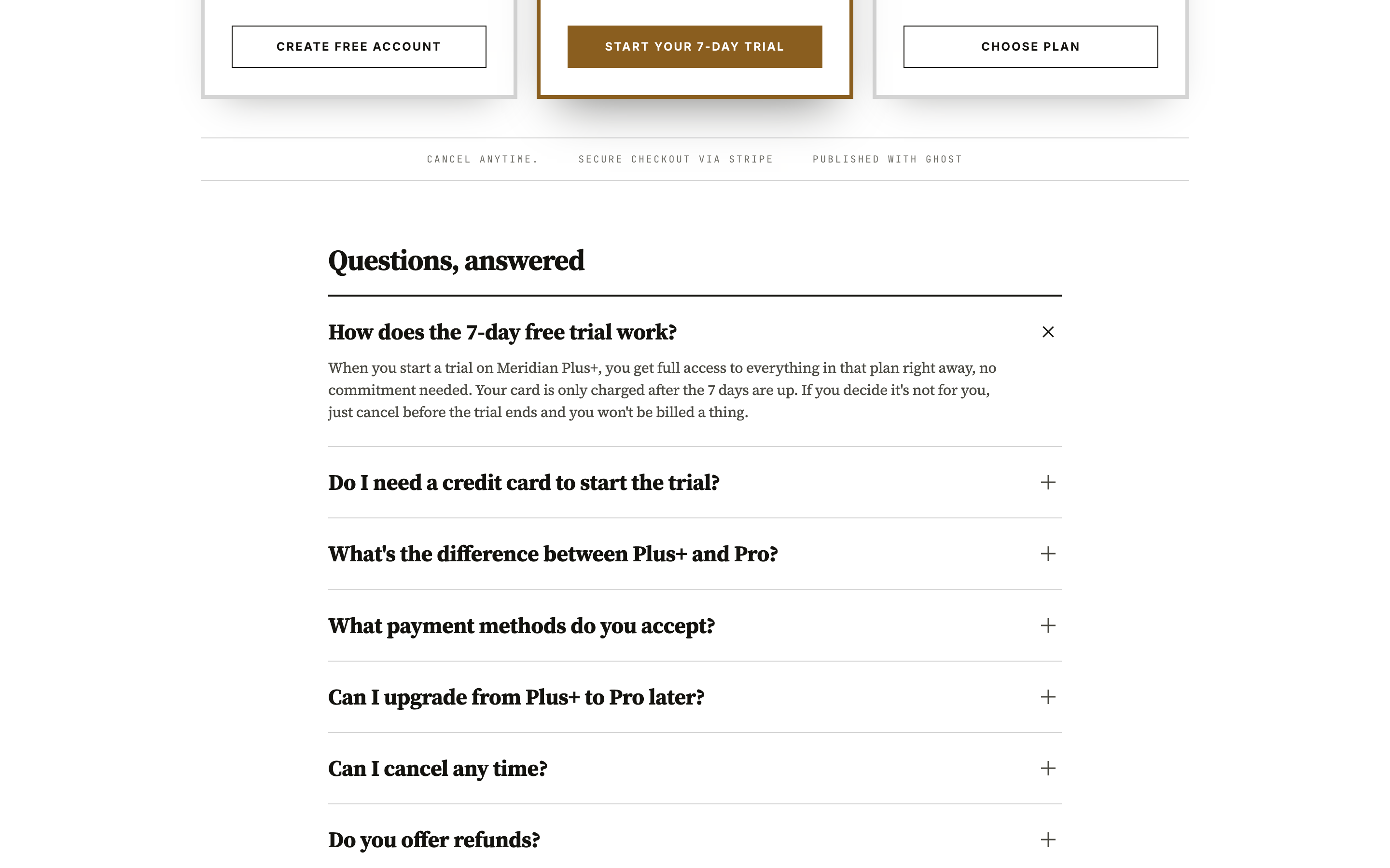
With no tag, the page opens on a full-width ink hero — your headline, excerpt and the billing switch on the theme's dark band — and a row of plan cards lifts up over its edge: one clean bordered card per plan, big lining figures for the prices, and the most popular plan framed in your accent colour with a "Most popular" stamp. Beneath the cards a slim reassurance line notes that plans cancel anytime, checkout is handled by Stripe, and access is instant.
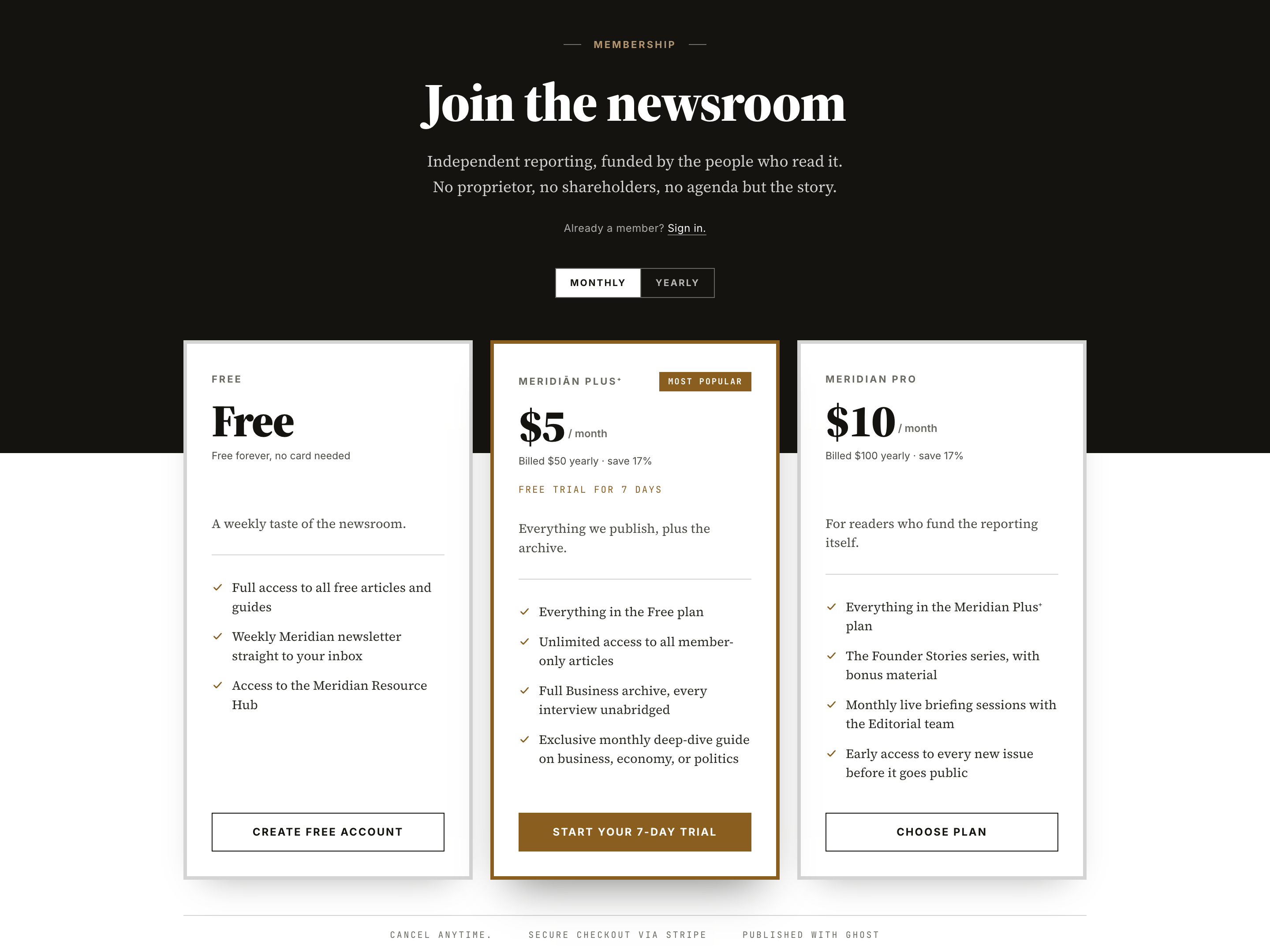
The row lays itself out for the number of plans you sell and never leaves a stray card stranded on its own row:
| Plans | Phone | Tablet | Desktop |
|---|---|---|---|
| 1 | one card, centred | one card, centred | one card, centred |
| 2 | stacked | two across | two across |
| 3 | stacked | three across | three across |
| 4 | stacked | two by two | four across |
| 6 | stacked | three across, two rows | three across, two rows |
Prices, trials and benefit lists line up across every card, whether or not a given plan offers a trial.
Compact — Join Card
#compact-tier-pickerAdd the internal tag #compact-tier-picker to the page (type #compact-tier-picker into the tag field — the leading # keeps it internal, so it never shows publicly) and the plans become a conversion-focused order form under the same ink hero: a ruled plan picker on the left, each row with an expandable "What's included", and an order summary beside it — with the checkout button — that updates as you switch plans and billing period.
Pick the Free plan and a signup form appears in place of the checkout button, so a reader can join without leaving the page. Paid plans hand off to Portal.
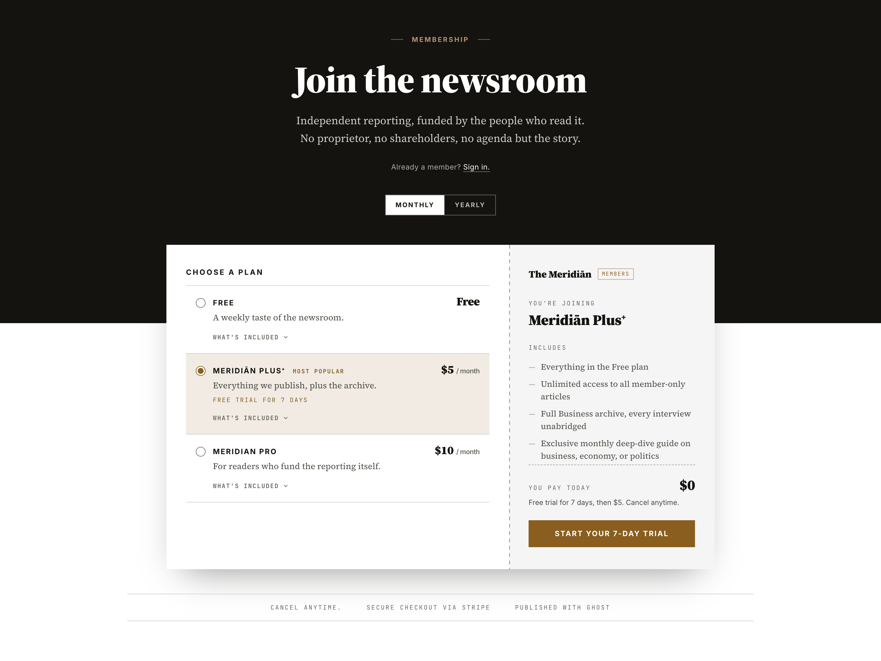
Both layouts read the same tiers — the tag only changes the presentation, so you can switch back and forth freely.
Free trials
Set a trial length on a paid tier in Settings → Tiers and the page picks it up:
- the plan's button reads "Start your N-day trial" instead of "Choose plan";
- the plan shows a "Free trial for N days" line;
- in the order form, the summary reads "You pay today — $0" with "Free trial for N days, then $5." beneath it.
Portal applies the trial at checkout, so there is nothing else to set up.
The page body
Anything you add to the page body renders below the plans, styled to match. Author it with native Ghost cards:
- FAQ — add Toggle cards, one per question. The theme restyles them as a flat, ruled accordion with a slim
+that turns into a×. - A reader quote — a Quote card.
- Where your membership goes — Callout cards, or plain headings and paragraphs.
Heading levels
The page already has a top-level heading (your page title), so start body sections at Heading 2 to keep the outline in order for readers and assistive tech.
The Subscribe button across your site
Once the join page exists, the theme points the site's signup actions at it instead of opening the Portal popup:
- the masthead Subscribe button;
- the Subscribe button in the hamburger menu;
- Become a member at the end of a story;
- Become a member / Upgrade on the paywall of a members-only story;
- Compare plans in the Membership CTA band above the footer.
Delete or unpublish the page and every one of them quietly falls back to Ghost's Portal signup, so your site always has a working signup path with or without the page.
Good to know
- No theme settings. The whole page comes from your tiers and the page body; there is nothing to configure under Design & branding.
- Hidden until ready. No
joinpage or a draft, and the page doesn't exist. With members turned off site-wide, the page renders as an ordinary page — headline, excerpt and body — with no plans and no billing switch. - Keep the URL
join. Both the template and the site-wide Subscribe routing key off it. - The Membership CTA band doesn't appear here. Your plans are the offer on this page; the band would repeat a price beneath them. It carries on as normal everywhere else.
- The reassurance line is honest by design. It claims only what is true of any Ghost site — self-serve cancellation, Stripe checkout, instant access on signup — and appears only when paid plans are purchasable. Don't want it? Add the internal tag
#hide-trust-stripto the page and it's gone. - Member-aware. Signed-in readers see "Change plan" and "My account" instead of signup buttons, and the page greets them by email.
- Built for keyboards and screen readers. The plan picker is a real radio group — native browser controls, so arrow keys move between plans exactly as they do in any form — the billing switch announces its state, every control has a visible focus ring, and motion respects "reduce motion".
- Prints sensibly. The plans print as a single column; the switch, the summary and the buttons don't.
- Styling hooks. Restyle any part from Code injection —
[data-region="membership"],[data-component="tier-card"],[data-component="plan-row"],[data-component="order-summary"]and more. See the Hook reference.
Troubleshooting
No plans are showing
Check that members are enabled (Settings → Membership) and that you've created tiers (Settings → Tiers). If only the Free plan shows, Stripe isn't connected — connect it under Settings → Membership and your paid tiers appear. If Stripe is connected, check that at least one price is ticked under Available prices in the Signup portal settings.
I get the plan cards, not the order form (or the other way round)
The order form only appears when the page carries the internal tag #compact-tier-picker. Add it for the order form, remove it for the cards. Type the tag exactly, including the leading #.
The Subscribe button doesn't go to my page
Make sure the page exists with the exact URL join, is published (not draft or scheduled), and that members are enabled. Otherwise the button falls back to the Portal popup by design.
A plan's list is empty
The list under each plan comes from that tier's Benefits field in Settings → Tiers. Add benefits there — including on your Free tier — and they appear.
The yearly saving isn't shown
The saving only appears when a tier's yearly price is genuinely below twelve monthly payments. If your yearly price is twelve times the monthly one, there is no saving to claim and the line is left out. It also needs both Monthly and Yearly ticked under Available prices in the Signup portal settings.
Only one price shows, or the page opens on yearly prices
The page follows your Signup portal settings (Settings → Membership → Signup portal → Customize → Signup options). Available prices decides whether monthly, yearly or both appear, and Default price at signup decides which one the page opens on when you offer both. See Monthly, yearly or both.
Reader controls
How Meridian's reader controls work — a masthead popover with text size and Light/Dark/System appearance, remembered per reader and synced across tabs.
Membership CTA
A full-bleed member signup band rendered above the site footer on every page. Editorial copy lives on a Ghost page; the pricing column adapts automatically to whether paid plans are connected; delete the page to hide the band site-wide.