Navigation
Meridian uses Ghost's two navigation lists for two different purposes — the primary nav drives the masthead section bar; the secondary nav drives the hamburger drawer and footer columns.
Ghost gives every site two navigation lists out of the box — Primary and Secondary. Meridian uses both for different roles. Edit them at Settings → Navigation.
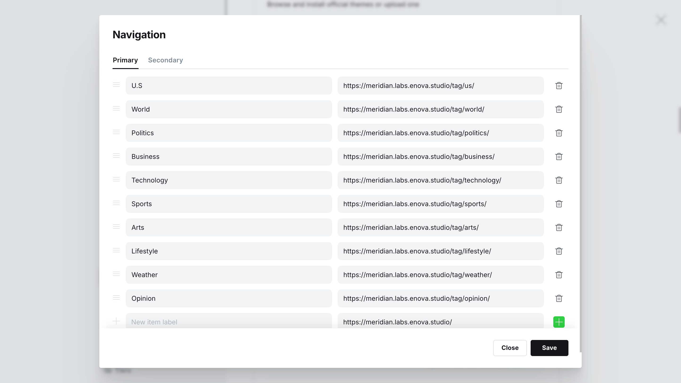
Primary navigation — the masthead section bar
The primary list renders as a horizontal scroll list under the masthead. It's where you put your section links — Politics, Markets, Opinion, Culture — the things readers will keep returning to.
On phones the list scrolls horizontally with an edge-fade gradient indicating overflow. On desktop the items expand to fill the available width.
How to set it up
Go to Settings → Navigation in Ghost Admin.
Click into the Primary navigation section. Add one row per section: type the visible label, then the URL.
Click Save. Reload your site — the masthead will update.
Keep it short
The masthead is a horizontal scroll list, but readers won't scroll. Keep your primary nav to 5–8 sections for the cleanest masthead. Everything else belongs in the secondary nav (drawer + footer).
Compact header: overflow becomes “More”
With the Compact header layout, primary-nav links that don't fit on the single row collapse into a More dropdown at the end instead of scrolling. Order matters — the first links stay visible, later ones move into More.
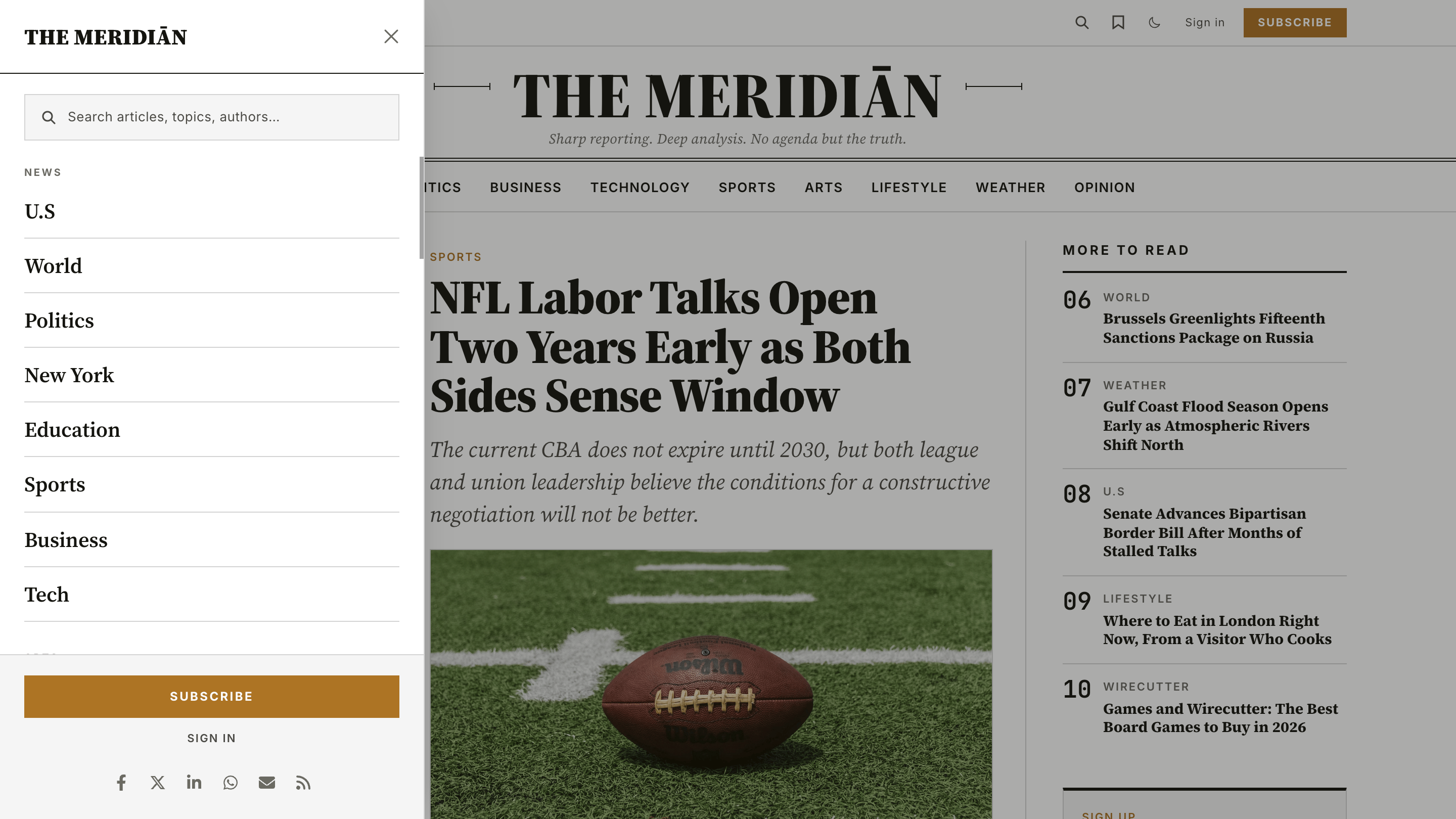
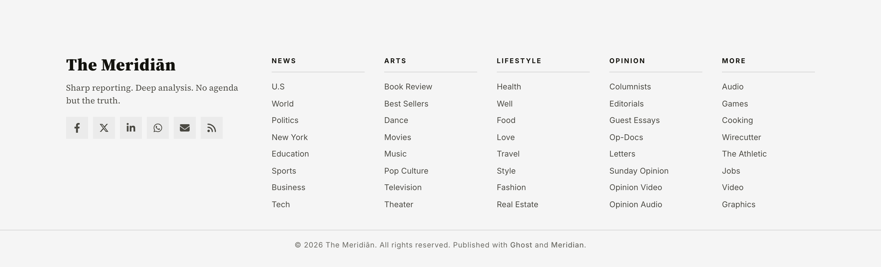
Secondary navigation — the hamburger drawer + footer columns
The secondary list is the utility / index nav. It powers two surfaces:
- The hamburger drawer that slides in from the masthead (visible on every viewport).
- The footer column groups at the bottom of the site.
Both surfaces use the same source data. Edit secondary navigation once and both update.
How to set it up
Go to Settings → Navigation in Ghost Admin.
Click into the Secondary navigation section.
Add your items. For a simple flat list (single column in the footer, one section in the drawer), add rows the normal way: label + URL.
For a grouped layout with section headers, use the # and - prefix conventions described below.
Click Save. Reload your site — both the drawer and the footer will update.
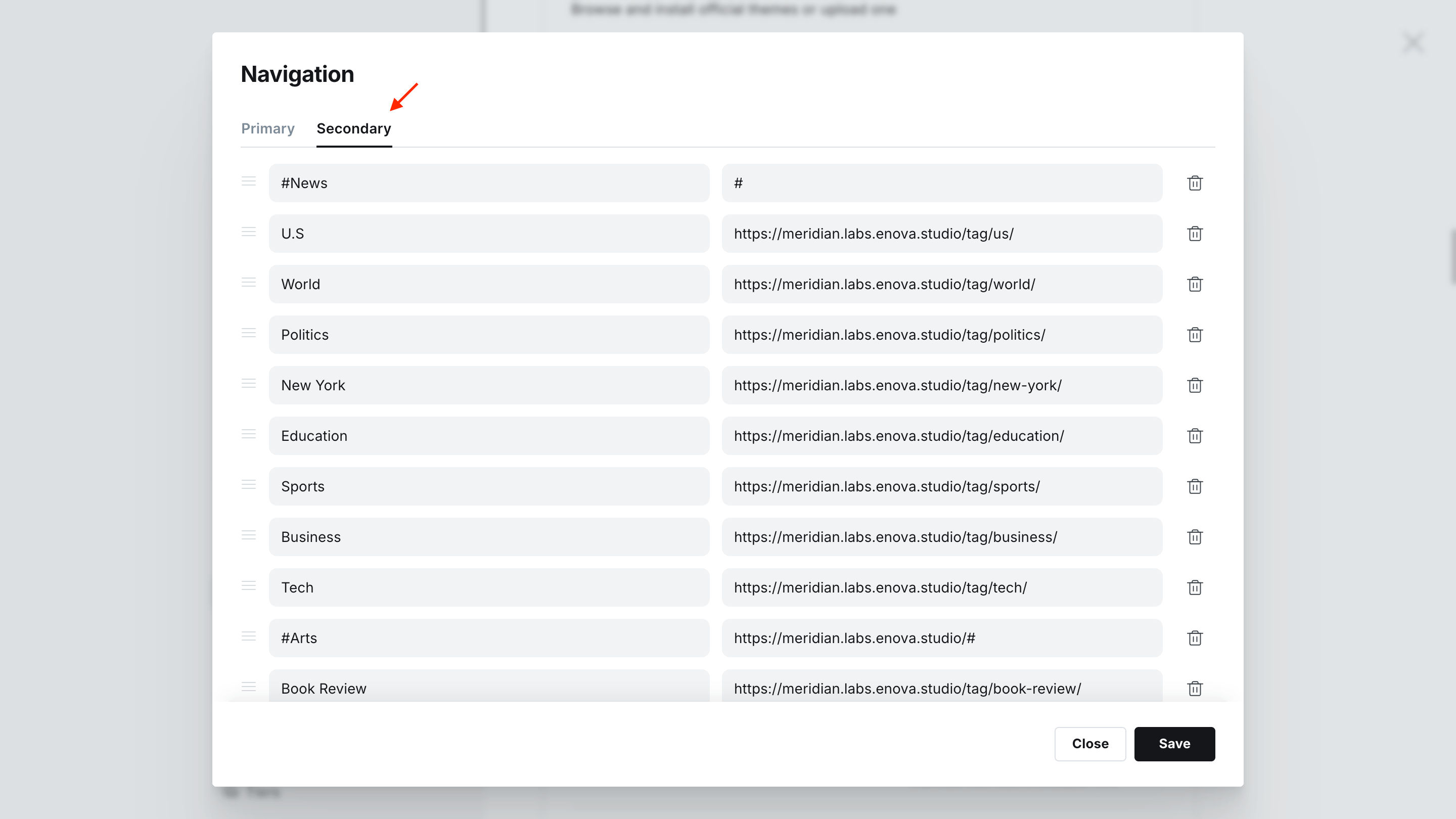
Section headers and sub-items
To get grouped columns in the footer and labelled sections in the drawer, use two label-prefix conventions:
#prefix — turn an item into a section heading. The URL field can be#(a no-op) or a real URL (the heading itself becomes a link).-prefix — turn an item into a sub-item under the most recent heading. Sub-items render slightly smaller and inset.
Example
If your secondary nav looks like this:
| Label | URL |
|---|---|
#News | # |
-U.S | /tag/us/ |
-World | /tag/world/ |
-Politics | /tag/politics/ |
#Arts | # |
-Book Review | /tag/book-review/ |
-Best Sellers | /tag/best-sellers/ |
-Dance | /tag/dance/ |
#Lifestyle | # |
-Health | /tag/health/ |
-Well | /wellness/ |
...you'll get three labelled column groups in the footer and three labelled sections in the drawer.
Drawer open with grouped sections
Footer columns with grouped sections
Mixing flat and grouped works fine
You can intermix bare rows (no prefix) with grouped ones. Bare rows render as un-grouped items at the top of the drawer / footer, before any #-prefixed section starts. In practice we recommend committing to one style across the whole secondary nav — pick all grouped or all flat.
External links get a small arrow
Any URL that points off-site (different hostname from your site) automatically gets a small external-link arrow appended to it, in both the drawer and the footer.
Accessibility & interaction
The hamburger drawer follows the standard dialog UX:
- Click the drawer button to open; click again, click the backdrop, or press Esc to close.
- Focus is trapped inside the drawer while it's open (you can't accidentally Tab into the page behind it).
- Body scroll is locked while the drawer is open.
- Background content is marked
inertso screen readers ignore it. - The slide-in animation respects
prefers-reduced-motion: reduce— readers who request reduced motion get an instant show/hide. - In RTL locales (Arabic, Hebrew, Persian, Urdu) the drawer slides in from the right edge instead of the left.