

Home hero widgets
Put your own content cards in the homepage rail, under the newsletter box. Each widget is a Ghost page tagged
Home hero widgets are content cards you control in the homepage's right-hand rail, directly below the newsletter signup box. Each one is an ordinary Ghost page carrying the internal tag #home-hero-widget: whatever you write in the editor becomes the card. No theme settings, no code.
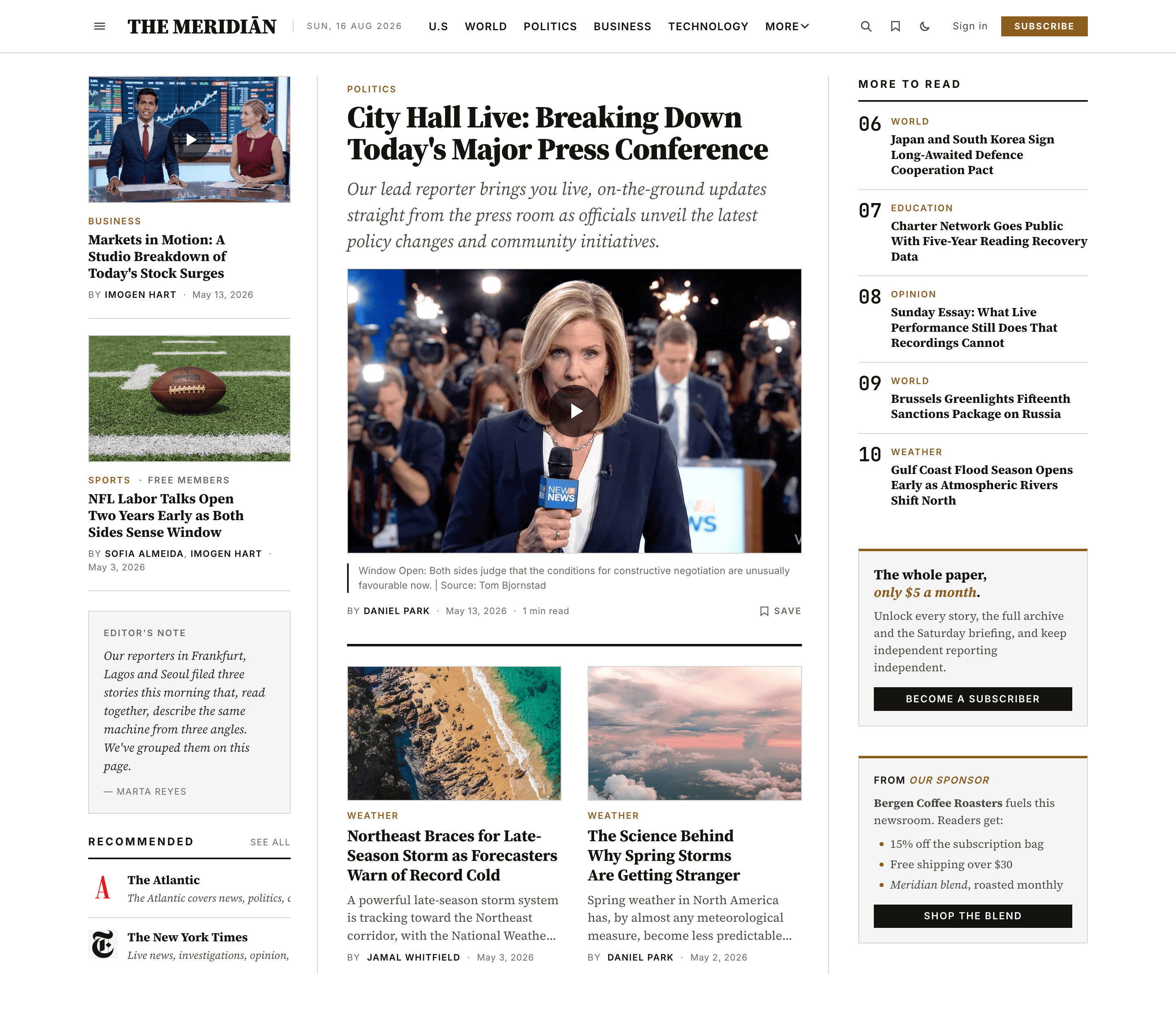
Use them for whatever earns its place beside your lead stories:
- a membership pitch ("The whole paper, only $5 a month") with a button to your membership page,
- a sponsor or house ad,
- a merch promo linking to your shop,
- an event or podcast plug,
- a third-party embed pasted as an HTML card.
You can publish several; they stack in the rail in publish order (oldest first). Feature a page (the star in page settings) to pin its card to the top.
Two widgets replace the newsletter box
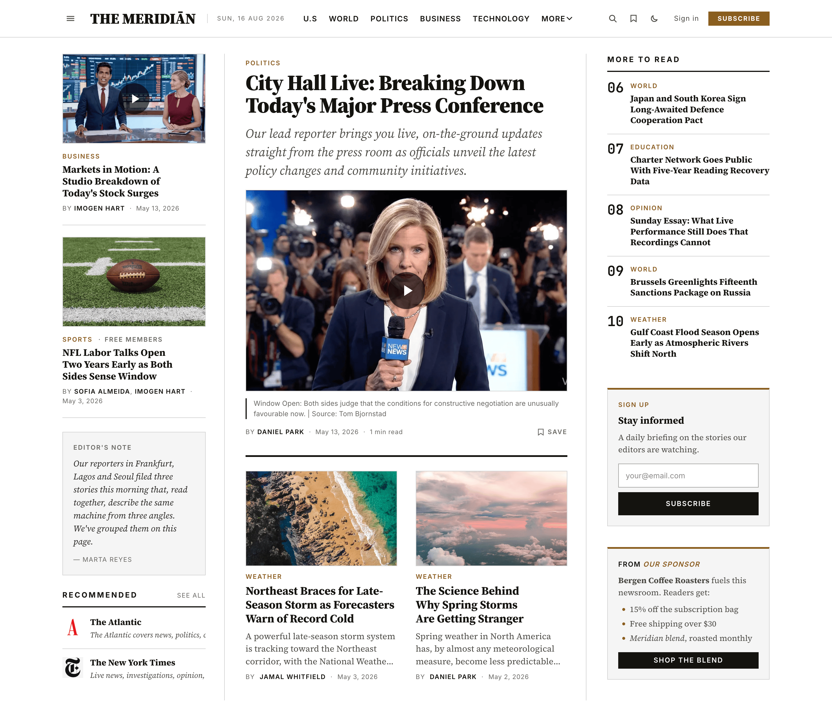
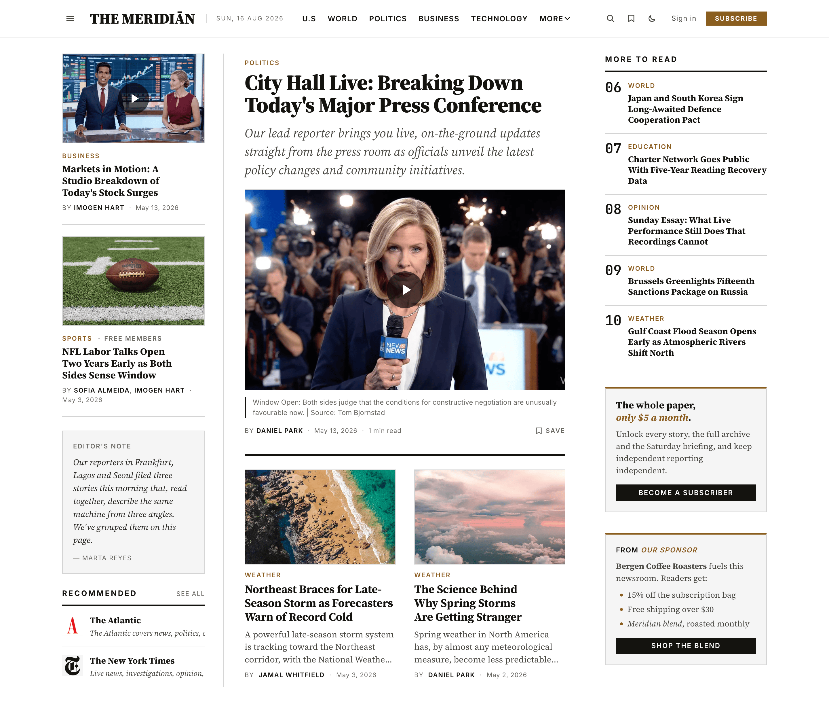
With two or more widget cards showing, the newsletter signup box above them hides itself to give your cards the room. With one (or none), it stays. Readers can still subscribe everywhere else the theme offers signup, like the membership band above the footer.
One widget: newsletter stays
Two widgets: newsletter steps aside
Create a widget
Create a page
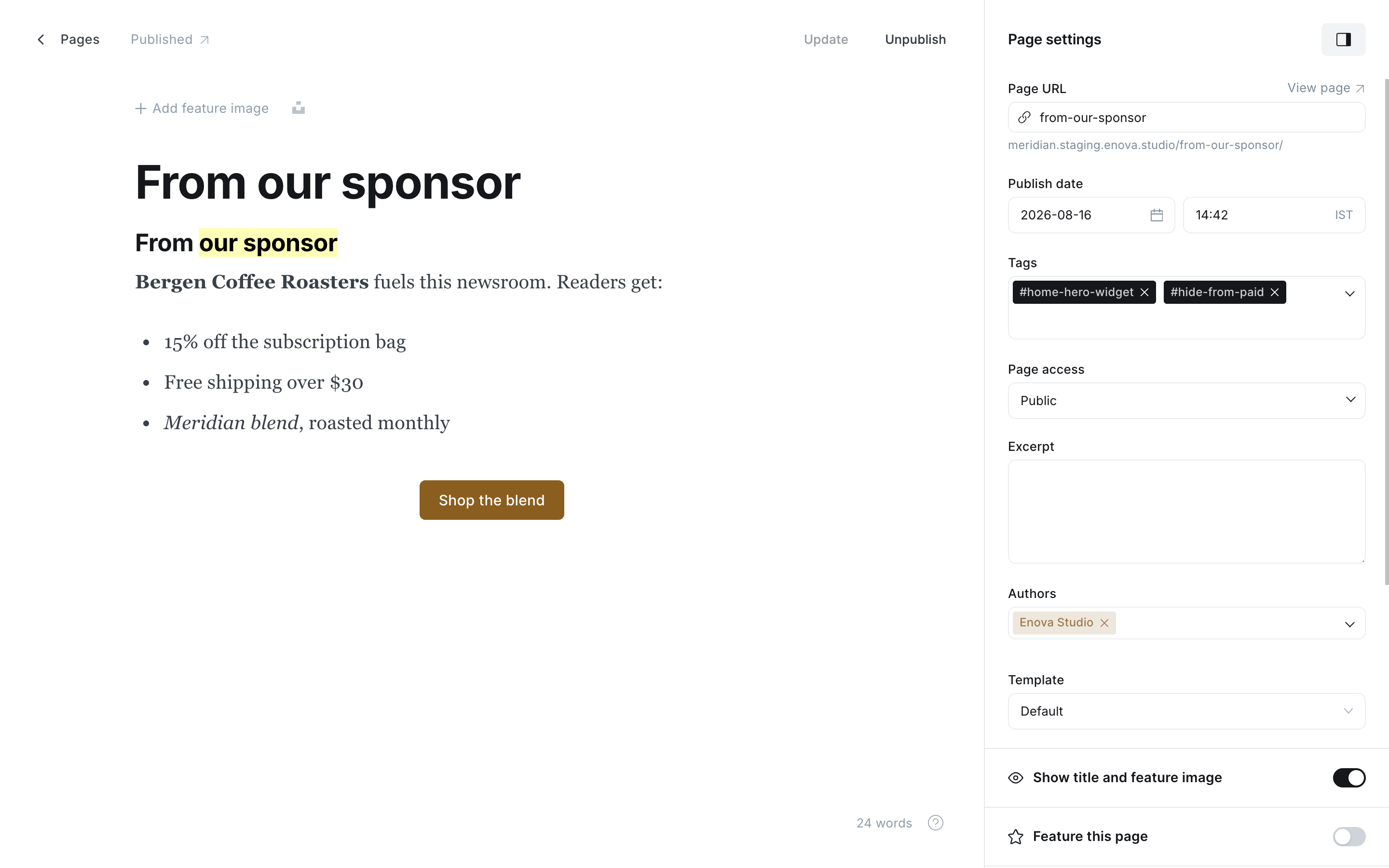
In Ghost Admin, go to Pages → New page. The page title is not rendered; it becomes the card's accessible label for screen readers, so name it after what the card is ("Membership pitch", "Sponsor: Bergen Coffee").
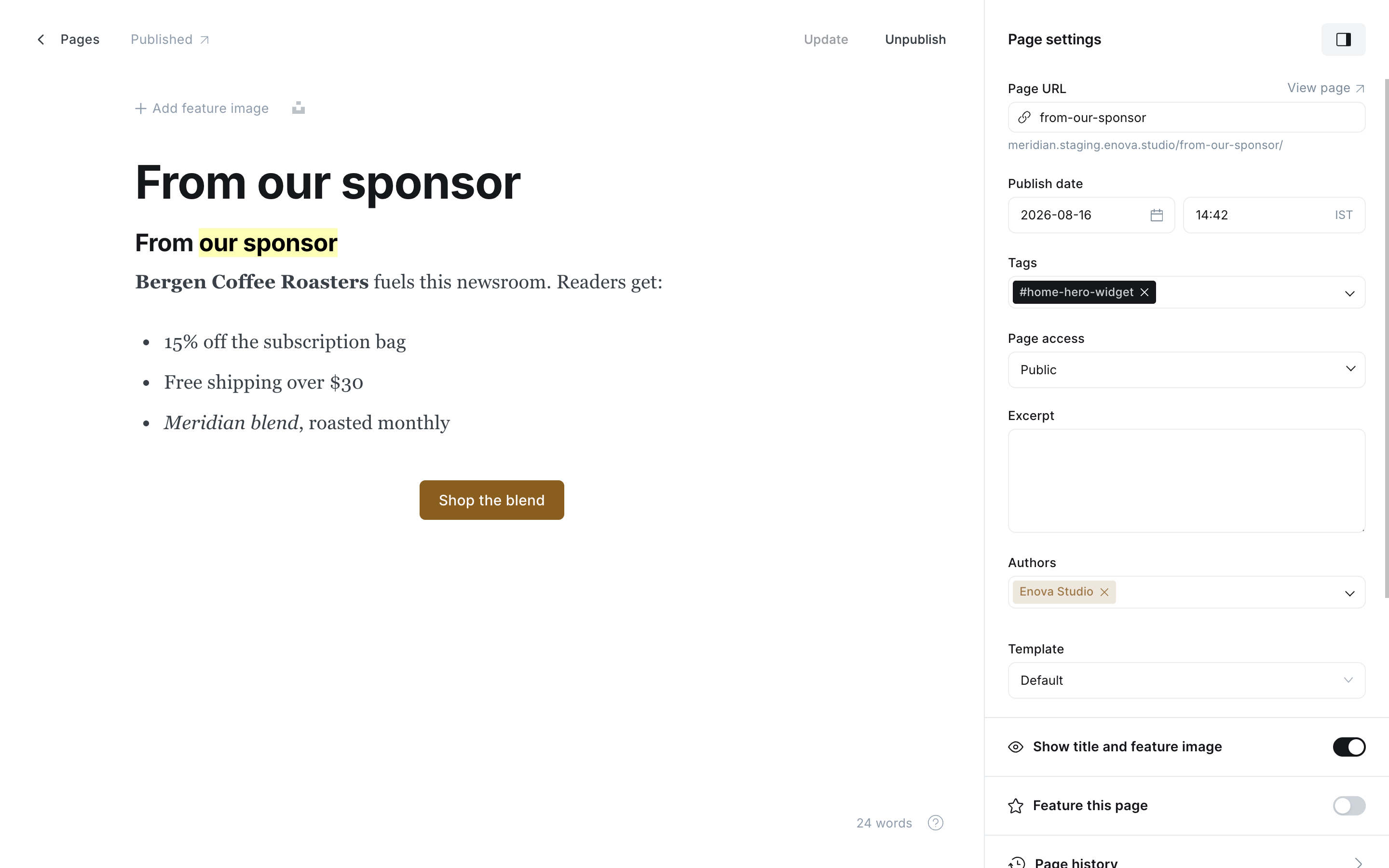
Tag it #home-hero-widget
In Page settings → Tags, add the internal tag #home-hero-widget (type the #; Ghost keeps internal tags out of your public tag lists). Not to be confused with the #hero-… tags you put on a post to pick its hero layout; this one goes on a page.
Write the card in the body
Everything in the page body renders inside the card, scaled to the rail's narrow column:
- Heading 2 for a card headline, Heading 3 for a small uppercase label (the "FROM OUR SPONSOR" look).
- Bold, italic, and highlight (
Cmd/Ctrl + Alt + H, renders in your accent colour) work as in any post. - Bulleted and numbered lists get accent markers.
- A Button card becomes the card's call to action, styled like the theme's own buttons; the label and link are entirely yours.
- Images, embeds, and HTML cards (for third-party widget code) render too.
Publish
Publish the page and the card appears on your homepage. Unpublish it, or remove the tag, to take it down.
Keep it rail-sized
The rail column is about 300px wide. A headline, a couple of sentences, and one button is the shape that works; long articles belong in posts, not widgets.
Hiding a widget from paying members
Add the internal tag #hide-from-paid to a widget's page and that card disappears for paying members. Use it on upgrade pitches so subscribers aren't nagged to buy what they already have. Widgets without the tag (sponsors, merch, events) show for everyone.
Ordering
- Widgets render oldest published first, so your rail stays stable as you add new ones.
- Featured pages jump to the top: the pin for your most important card.
- A tagged page with an empty body renders nothing, so you can draft in place safely.
Styling
Target the cards from Code injection with the theme's customization hooks:
/* every home hero widget */
[data-component="home-hero-widget"] { }

/* the content inside */
[data-component="home-hero-widget"] [data-part="body"] { }
Membership CTA
A full-bleed member signup band rendered above the site footer on every page. Editorial copy lives on a Ghost page; the pricing column adapts automatically to whether paid plans are connected; delete the page to hide the band site-wide.
Preferred source on Google
Add Meridian's end-of-article Google preferred source card — copy lives on a Ghost page with slug preferred-source; publish to show it, draft to hide.