Navigation Style
Switch the primary navigation between a vertical left sidebar and a horizontal top bar in the header.
The Navigation style setting lets you switch the primary navigation between a vertical left sidebar (default) and a horizontal top bar in the header. The style only affects desktop — phones and tablets always keep the slide-out hamburger drawer so longer menus remain reachable.
Navigate to the Design & branding settings in Ghost Admin and click Customize.
Expand the Site wide tab on the left-hand column.
Find the Navigation style dropdown and choose either Sidebar or Top bar.
Click Save to apply your changes.
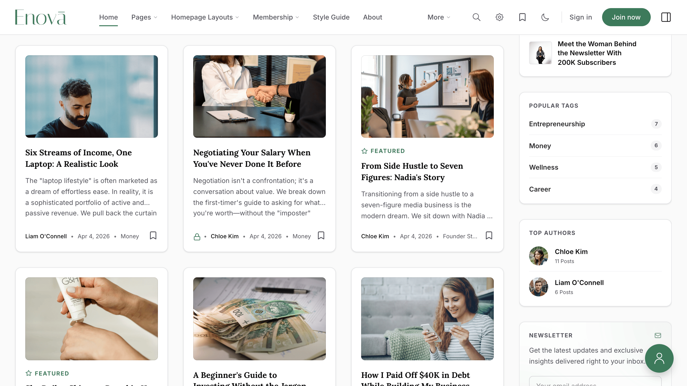
Sidebar (Default)
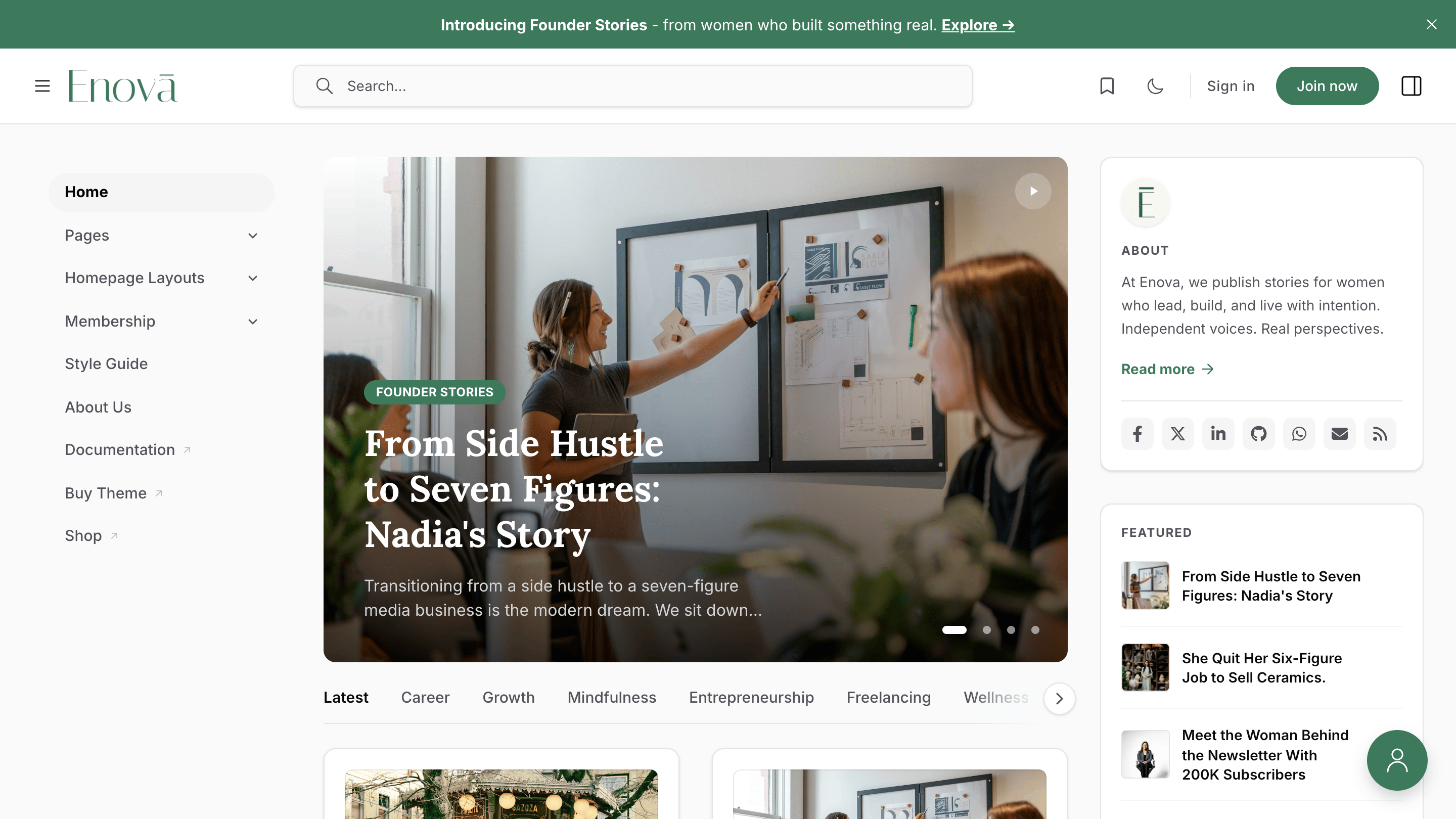
A vertical menu sits beside your content. The header keeps a wide search bar centered between the logo and the action icons.
Top bar
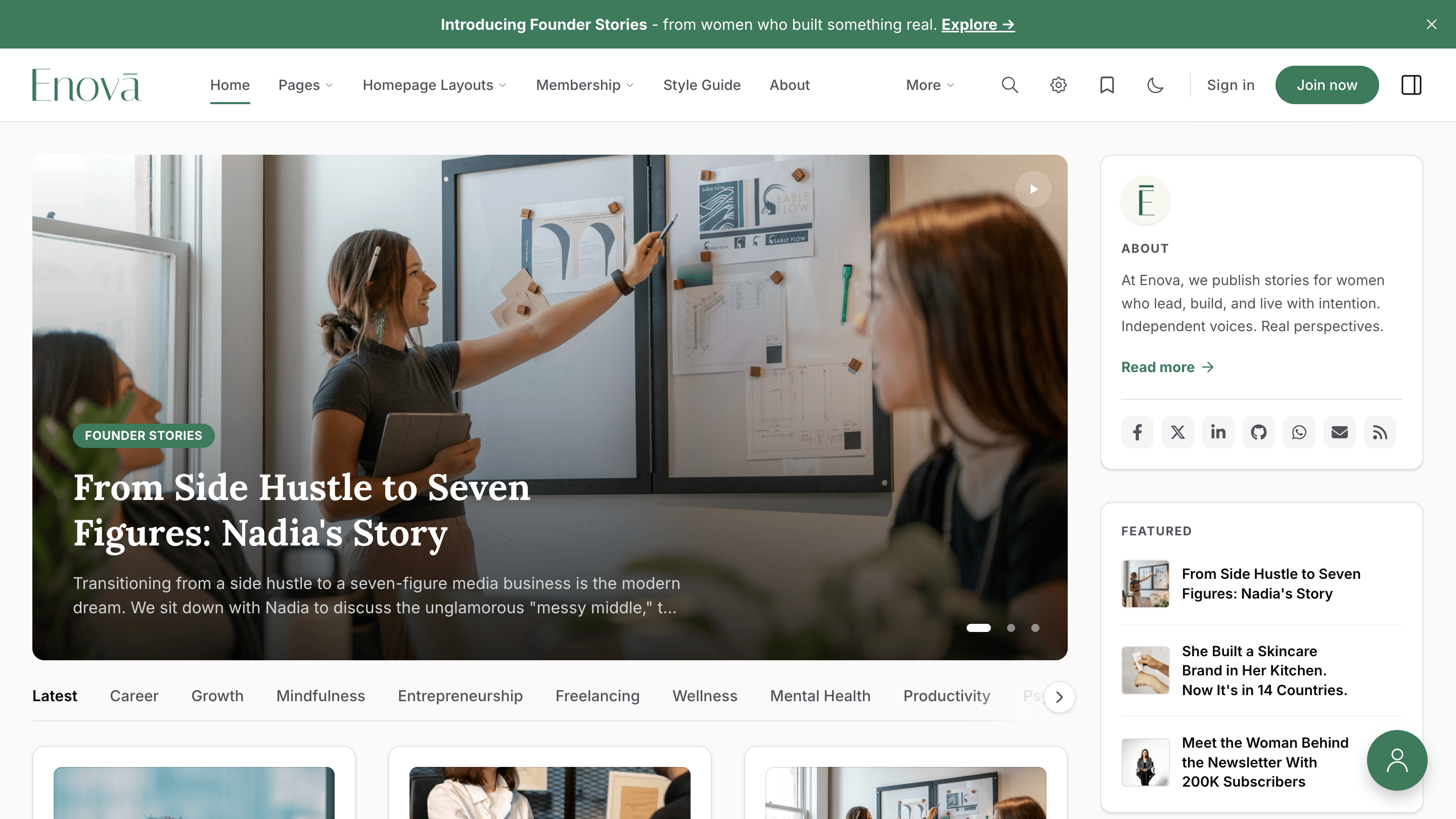
Menu items run horizontally inside the header. The wide search bar is replaced by a search icon, and a gear icon hosts theme and reading preferences.
Premium polish
Top bar items use a subtle underline accent for the active and hovered state. Submenus open with a soft slide-fade and a single-open invariant — opening one closes any other that was open. On mouse-equipped devices, hovering opens the menu after a short delay; clicking always toggles.
Smart overflow with the "More" dropdown
If the header doesn't have enough room to fit every primary menu item on one line, the theme automatically tucks the trailing items into a More dropdown so the layout stays clean at every breakpoint.
Overflow into More
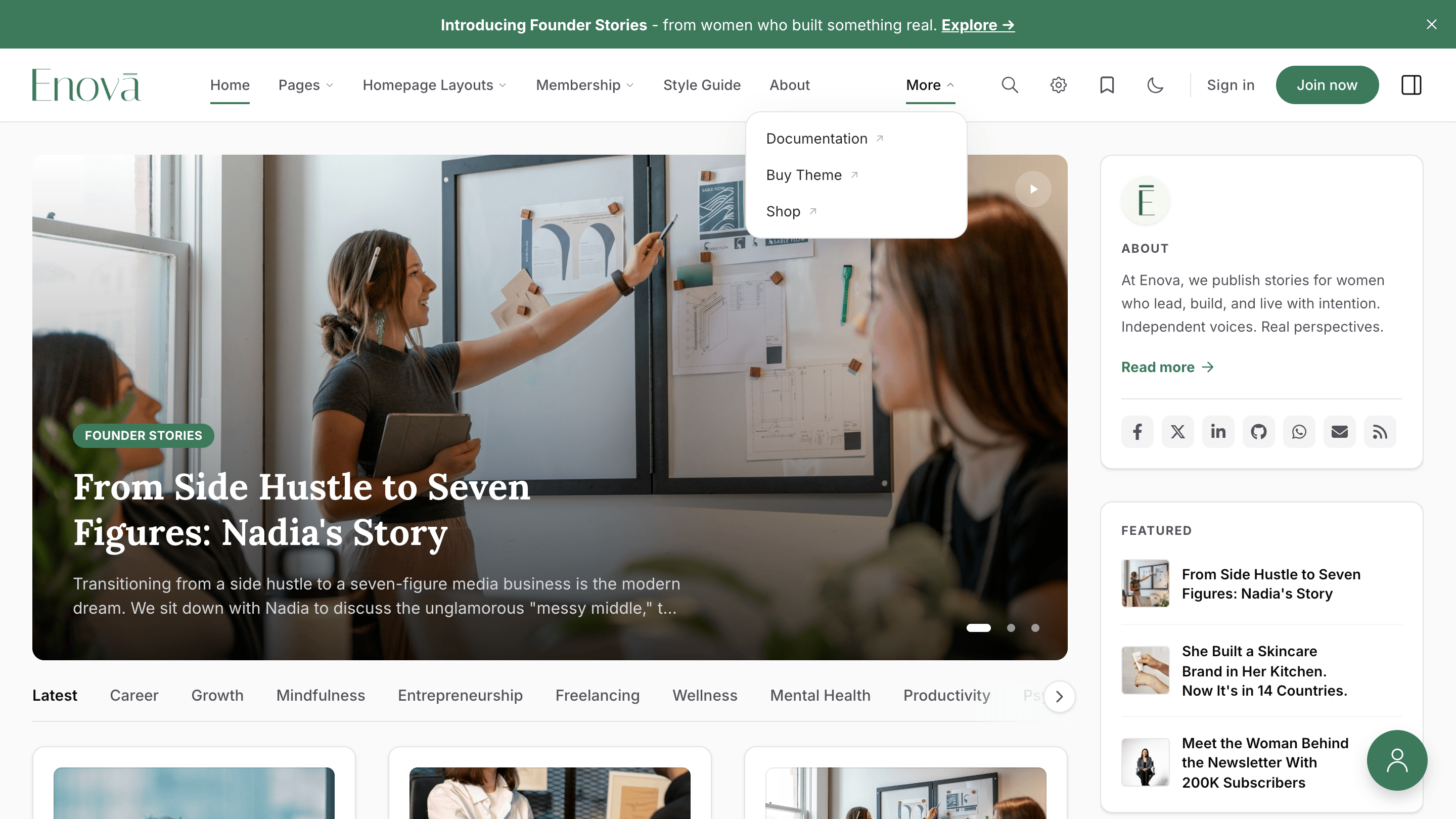
Items that don't fit collapse into a single More button on the right edge of the navigation. The theme re-measures whenever the window resizes and moves items in or out of More automatically.
Inside More, items that have nested children render with a small uppercase section heading and an indented sublist with a thin guide line on the left — the same nesting cue used by the sidebar. Standalone links sit at the same level as section headings and stay clearly distinct.
Nested menus become dropdown flyouts
The same - prefixed sub-items you already use in Ghost's navigation editor (see Multi-level Dropdowns) are honoured in Top bar mode. Each top-level item with children becomes a button that opens a flyout panel listing its sub-items.
Top bar dropdown flyout
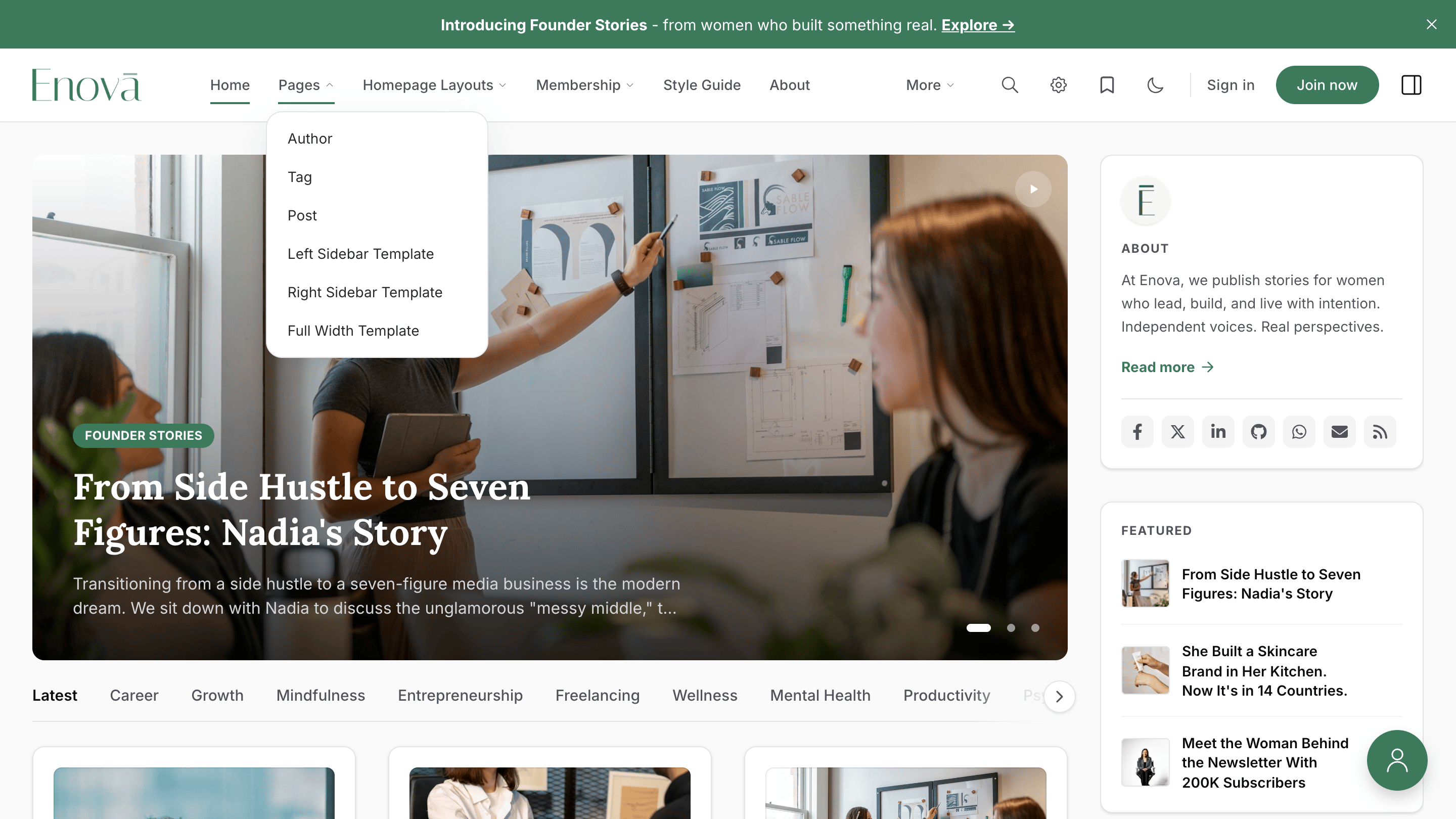
A click on the parent — or a hover, on devices that support it — opens a panel anchored to the trigger. Pressing Escape or clicking outside closes it. Keyboard users can press Down Arrow on a parent to open it and move focus to the first child.
Mobile keeps the hamburger drawer
Top bar mode is a desktop-only transformation. On screens narrower than 1024px, the header continues to show the hamburger button, the drawer continues to slide in from the side, and the full nested navigation remains accessible.
How Sidebar visibility behaves in Top bar mode
In Top bar mode, the left sidebar is replaced by the horizontal navigation on desktop. The Sidebar visibility setting (see Site wide → Sidebar Visibility) keeps controlling which page types reveal the mobile hamburger drawer, so you can still scope the drawer to posts, pages, or the homepage as needed.
Wider post grid on desktop
Because the left sidebar is hidden in Top bar mode, the main content area is wider on desktop. The theme uses that extra room to grow the post grid from two columns to three on List & Grid feeds, giving stories more breathing room.
Three-column post grid
Applies automatically on the homepage feed, tag pages, and author pages whenever Top bar mode is active and the viewport is at least 1024px wide.
Reading preferences move to a header popover
Because the desktop sidebar — which usually hosts the appearance, reading-size, and bookmark toggles — is no longer visible, a small gear icon appears next to the search icon in Top bar mode. Clicking it opens a popover with the same preference controls.
Preferences popover
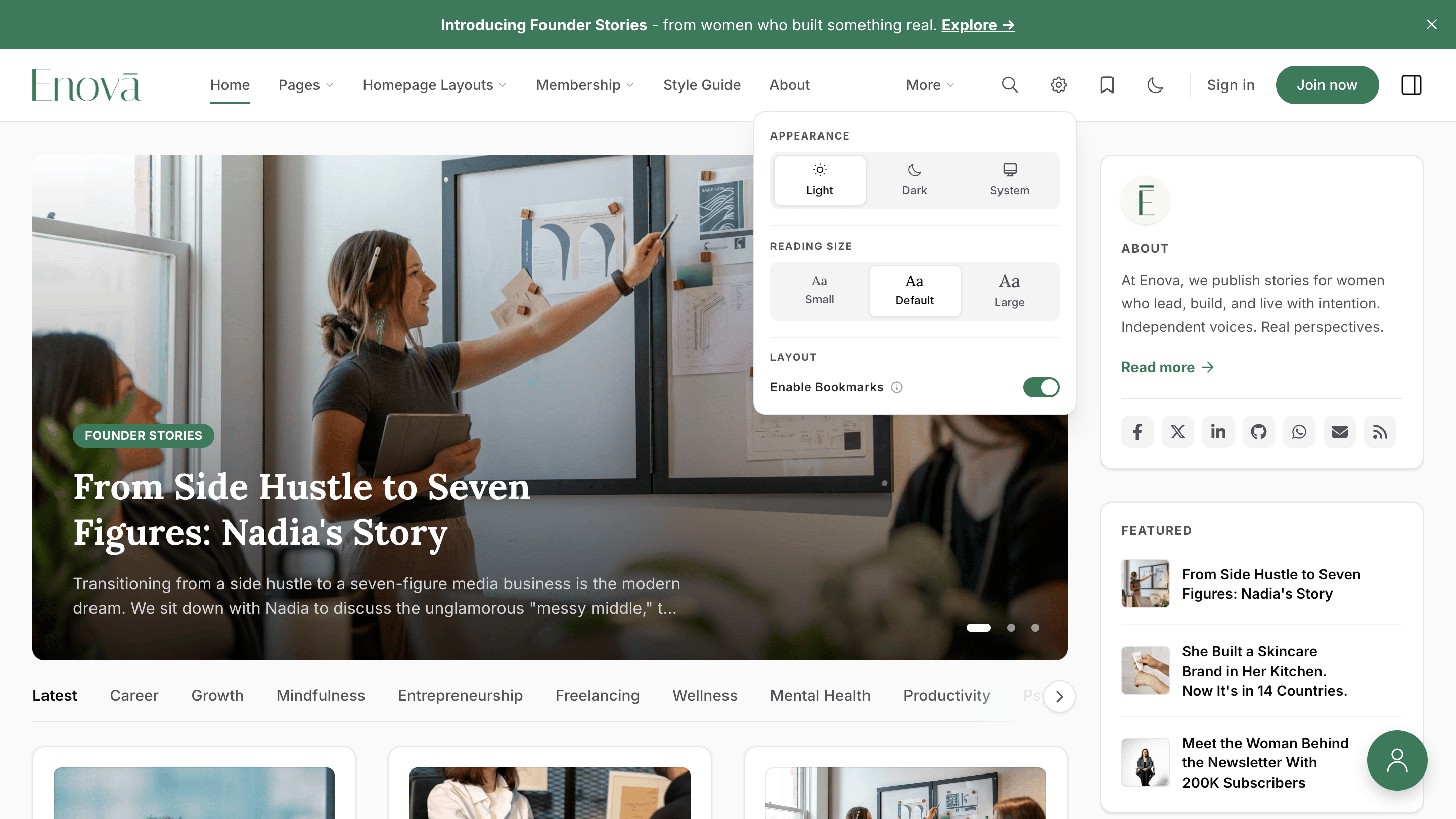
The popover mirrors the sidebar's Preferences panel: appearance (Light / Dark / System), reading size, and the Enable Bookmarks toggle. The "Save Sidebar view" toggle is hidden in Top bar mode because the desktop sidebar is permanently off.
Related
- Navigation — set up your menu items in Ghost's Primary and Secondary navigation.
- Navigation Icons — add icons next to your menu labels.