

Post Newsletter CTA
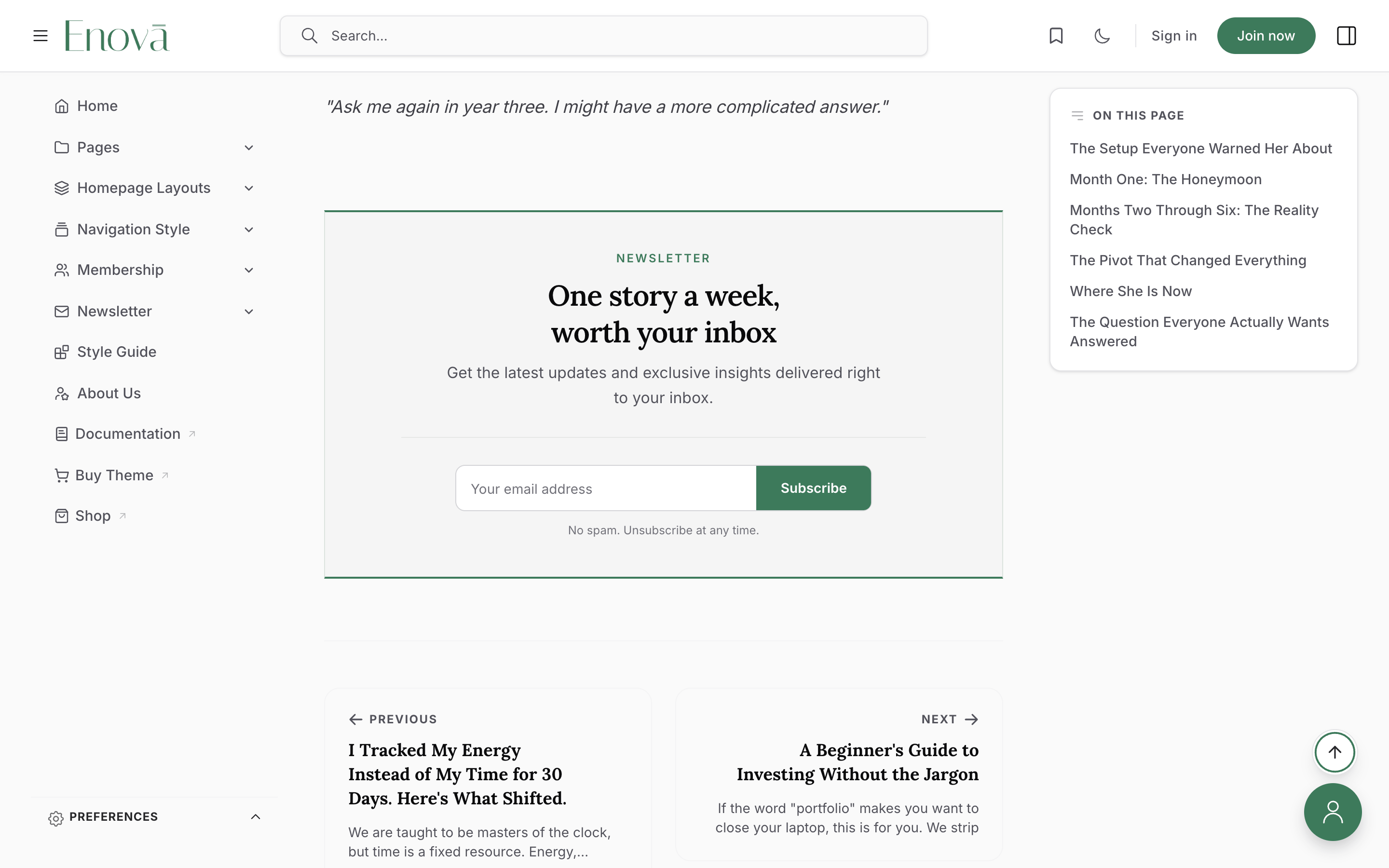
Close every article with a designed newsletter signup band. One Ghost page supplies every word, and the band builds itself from what you write.
Enova can close every post with a newsletter signup band, so the ask lands exactly where an engaged reader finishes, on every screen size. The sidebar signup never reaches phones; this one always does.
The feature is entirely opt-in. Nothing appears until you publish one Ghost page slugged newsletter-cta, and that page carries every word. There is nothing to configure and no layout to choose: write a short paragraph and you get a personal note, write a bulleted list and you get check-marked reasons to subscribe, add photos and you get a row of reader faces.
The form is Ghost-native (Portal handles the signup, the confirmation email, and the error states) and every signup is labelled post-cta in Ghost Admin → Members, so you can measure exactly what the band converts.
Where it lives
The band sits at the end of every post, between the article and the previous/next links. The newsletter-cta page itself is also reachable at yoursite.com/newsletter-cta/ like any Ghost page, so you can simply leave it out of your navigation.
Set it up
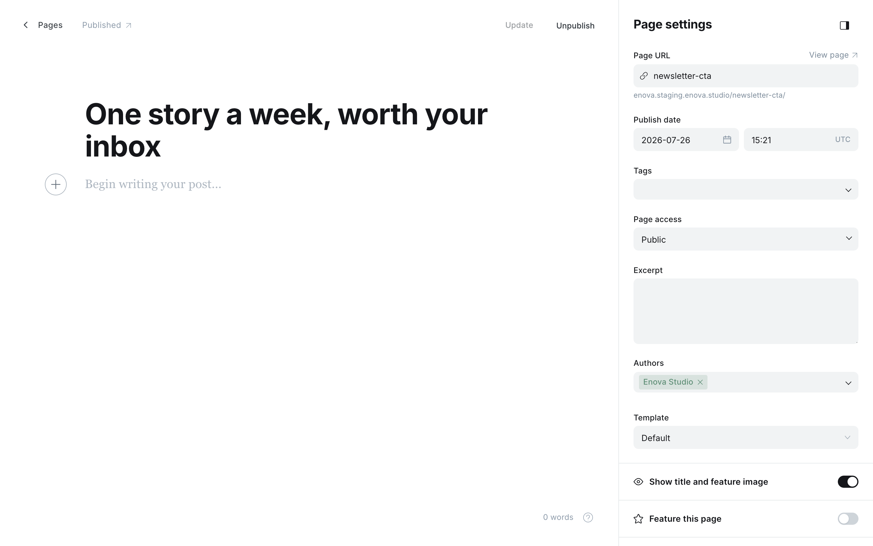
Create the page. In Ghost Admin, add a new page and set its slug to newsletter-cta under Page settings. The slug must match exactly.
Write the title as a headline. Unlike most utility pages, this title is shown to your readers as the band's headline, for example "One story a week, worth your inbox".
Fill in the supporting copy. The excerpt, meta title, and meta description each map to a part of the band. See the table below.
Add one public tag (optional). Name your newsletter with a tag and it becomes the small uppercase label above the headline.
Publish. Every post now ends with the band.
The page in Ghost
The band on your site
Who sees it
The band appears only when all of these are true:
- Your site has membership enabled (Settings → Access → Subscription access is not "Nobody").
- The reader is not signed in. Members never see it.
- The reader has full access to the post. On a paywalled post, signed-out readers already get the membership prompt, and Enova will not stack a second ask underneath it.
- The post does not carry the
#hide-newsletter-ctainternal tag.
Where the copy comes from
| Page field | Becomes | If left empty |
|---|---|---|
| Title | The headline | "Subscribe to our newsletter" |
| Excerpt (custom excerpt) | The short line under the headline | Your Subscribe text theme setting, then a translated default |
| Tag (any public tag) | The small uppercase label above the headline | "Newsletter" |
| Body (the page content) | Your space, see below | Skipped. The band is still complete |
| Meta title (Page settings → Meta data) | The subscribe button label | "Subscribe" |
| Meta description | The fine print under the field, and the reassurance line after signup | "No spam. Unsubscribe at any time." |
| Feature image | Nothing. It stays the page's social-sharing image | n/a |
What you can put in the body
The body is optional and it is your space. Leave it empty and the band is still finished: label, headline, intro line, signup field, fine print. Fill it in and whatever you write renders there, with your Ghost editor formatting intact: bold, italics, links, and highlights all come through as you wrote them.
Three shapes get an extra treatment.
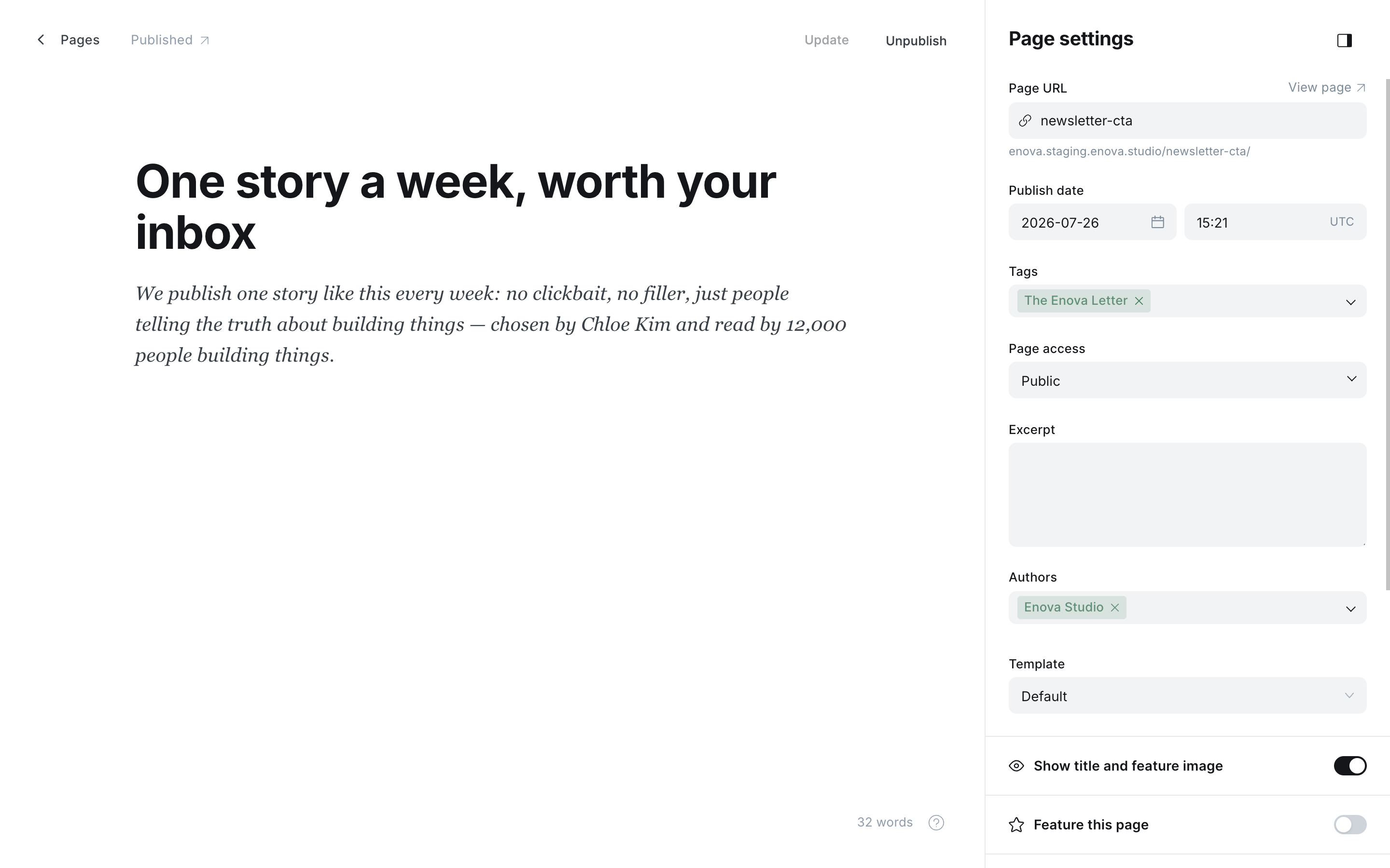
One short paragraph
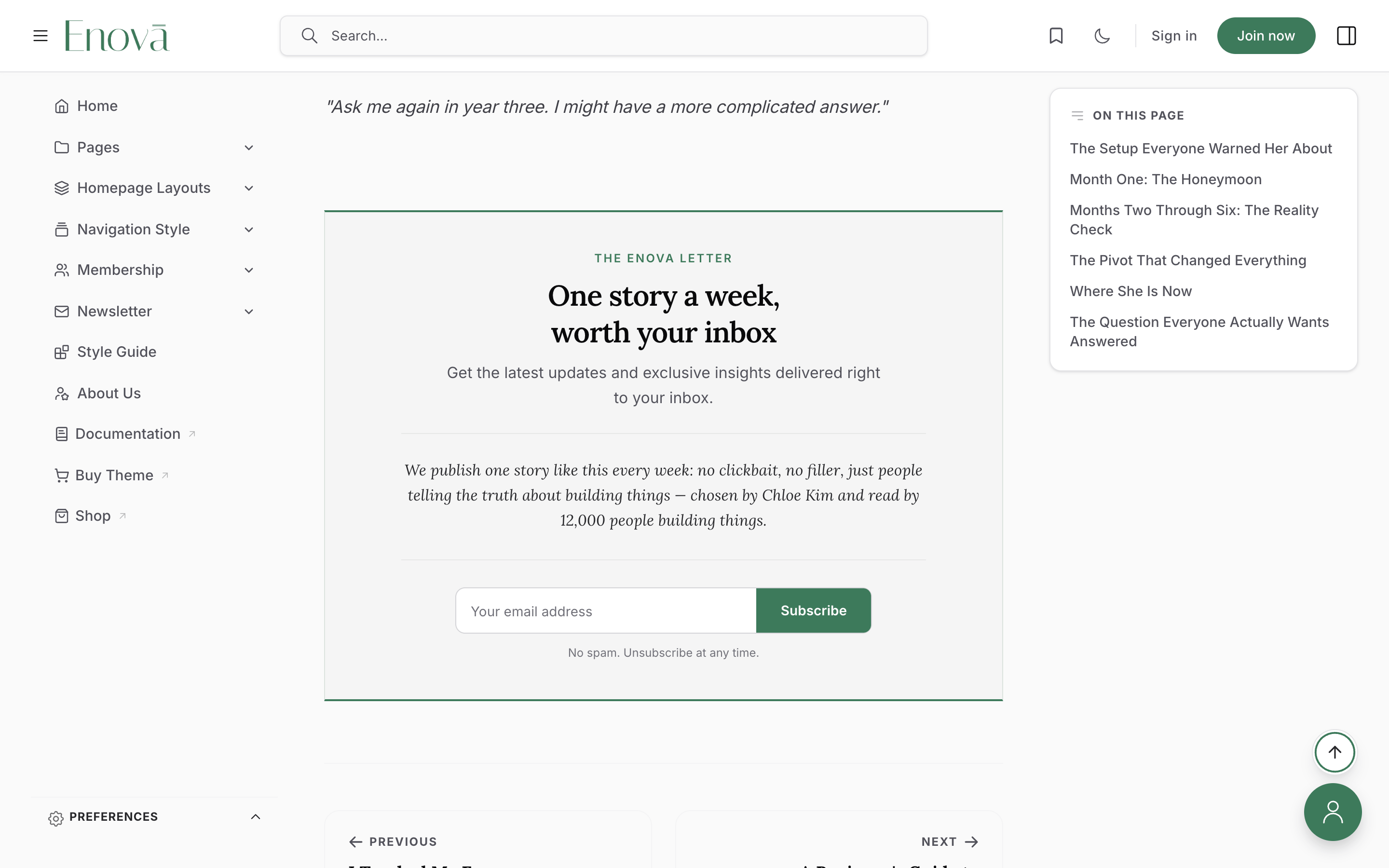
A single paragraph picks up the heading serif, which sets a short personal pitch apart from the intro line above it. Nothing else is imposed. If you want it italic, or want a phrase highlighted, do that in the editor and it will render.
Two or more paragraphs stay in the body font, which is the right call for a longer pitch.
A short note in the editor
The note in the band
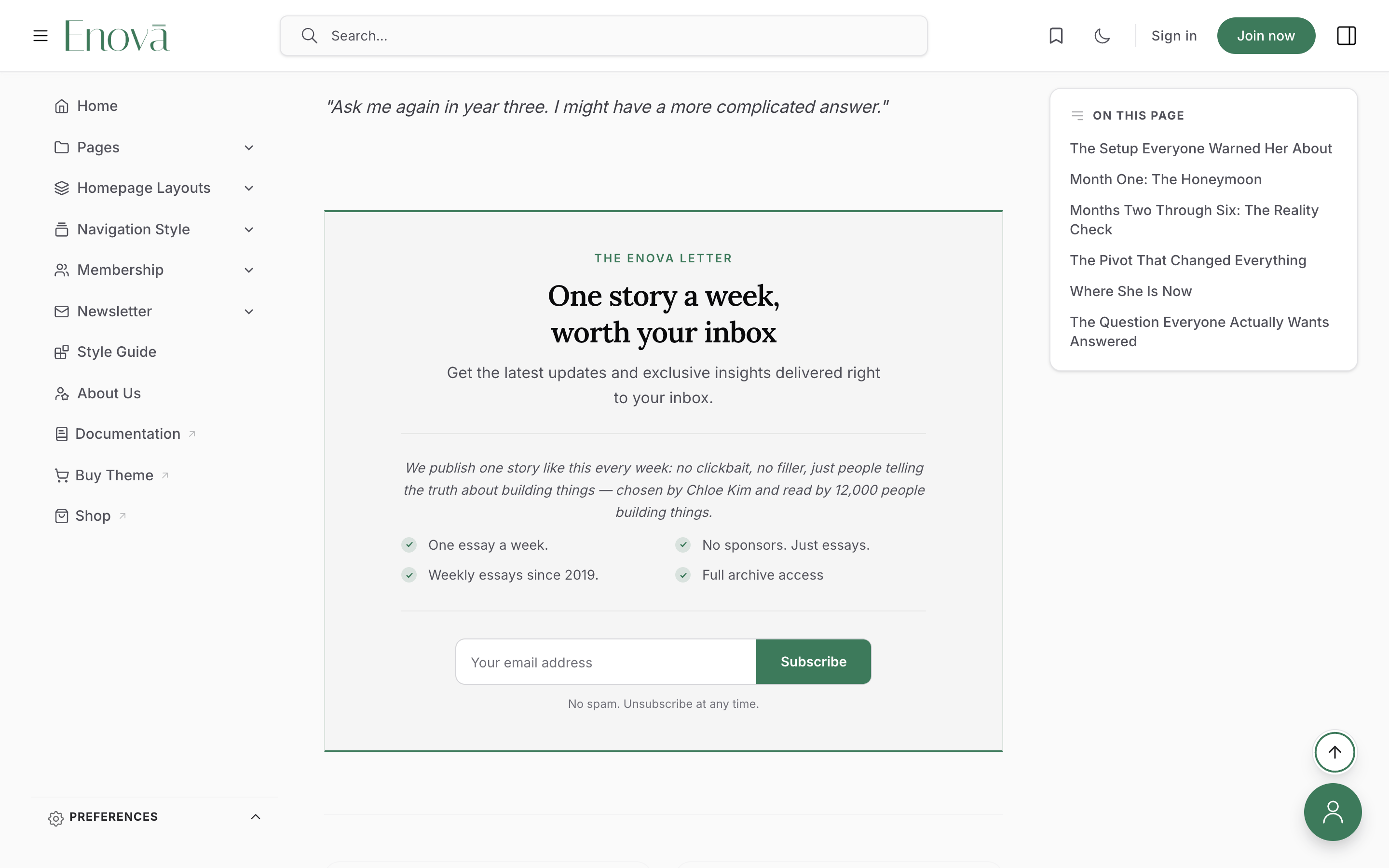
A bulleted list
Each bullet becomes a check-marked reason to subscribe, laid out in two columns once the article column is wide enough. Bold the opening words of each bullet for the classic pattern:
**One essay a week** every Friday morning
**No sponsors** in the body copy, ever
**Full archive** going back to 2019
A bulleted list in the editor
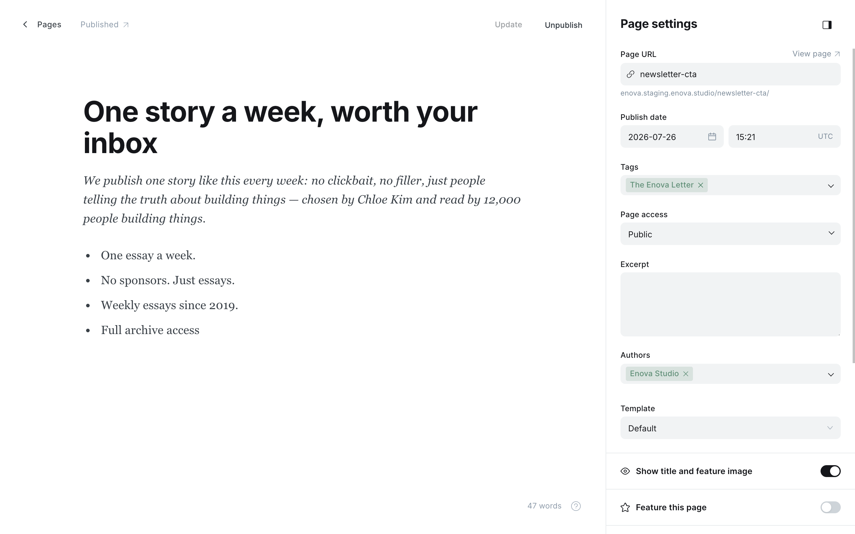
Check-marked reasons in the band
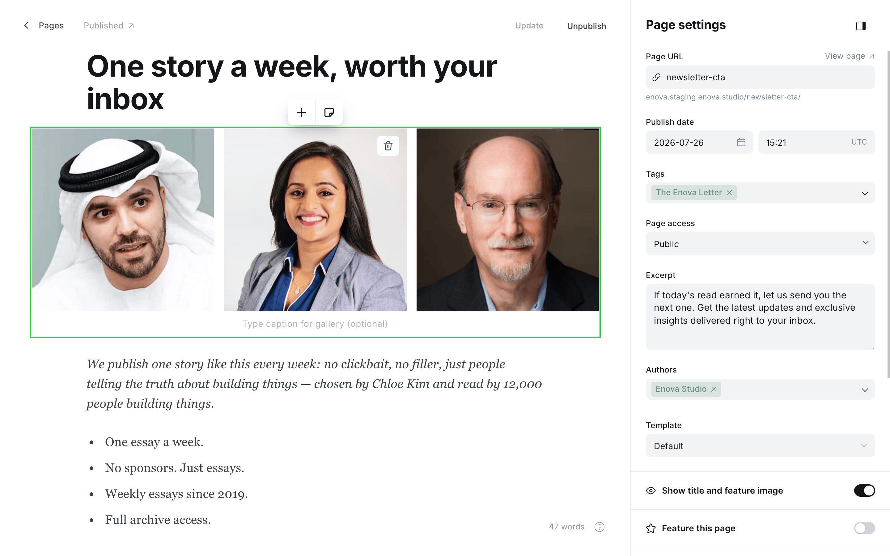
A gallery or image card, plus one short line
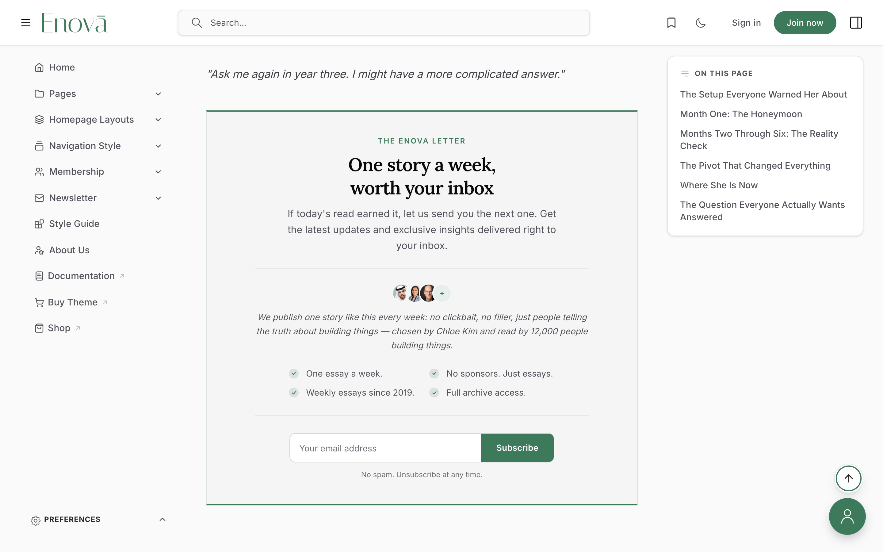
The photos become an overlapping row of reader faces and the paragraph sits beside them as your count line. Bold the number.
Only the first gallery row (up to 3 images) is shown, followed by a "+" badge; extra rows are hidden, as are captions on that row. Square-ish photos crop best. The faces appear first no matter where in the body you placed the card.
A gallery card in the editor
Reader faces in the band
Keep the claim honest
Enova never invents numbers or faces. Everything here is authored by you. Use a real reader count and images you have the rights to (your own photos, team members, or properly licensed avatars), and update the number as you grow.
After someone subscribes
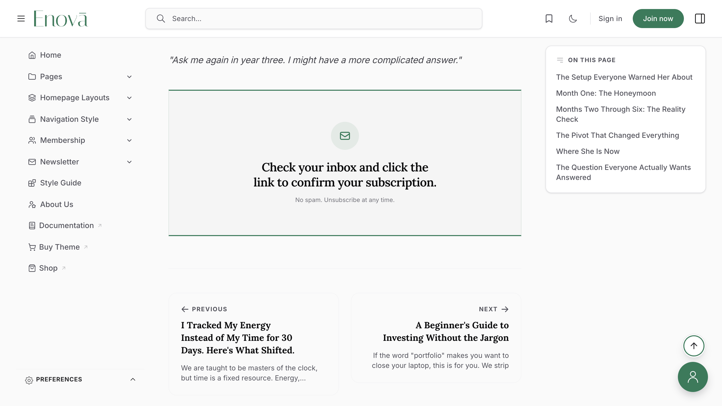
The whole panel is replaced with a calm confirmation: an envelope mark, a line telling the reader to check their inbox and click the link, and your fine print underneath. Readers never have to wonder whether the click worked, and no half-filled form is left on screen.
Turning it off for one post
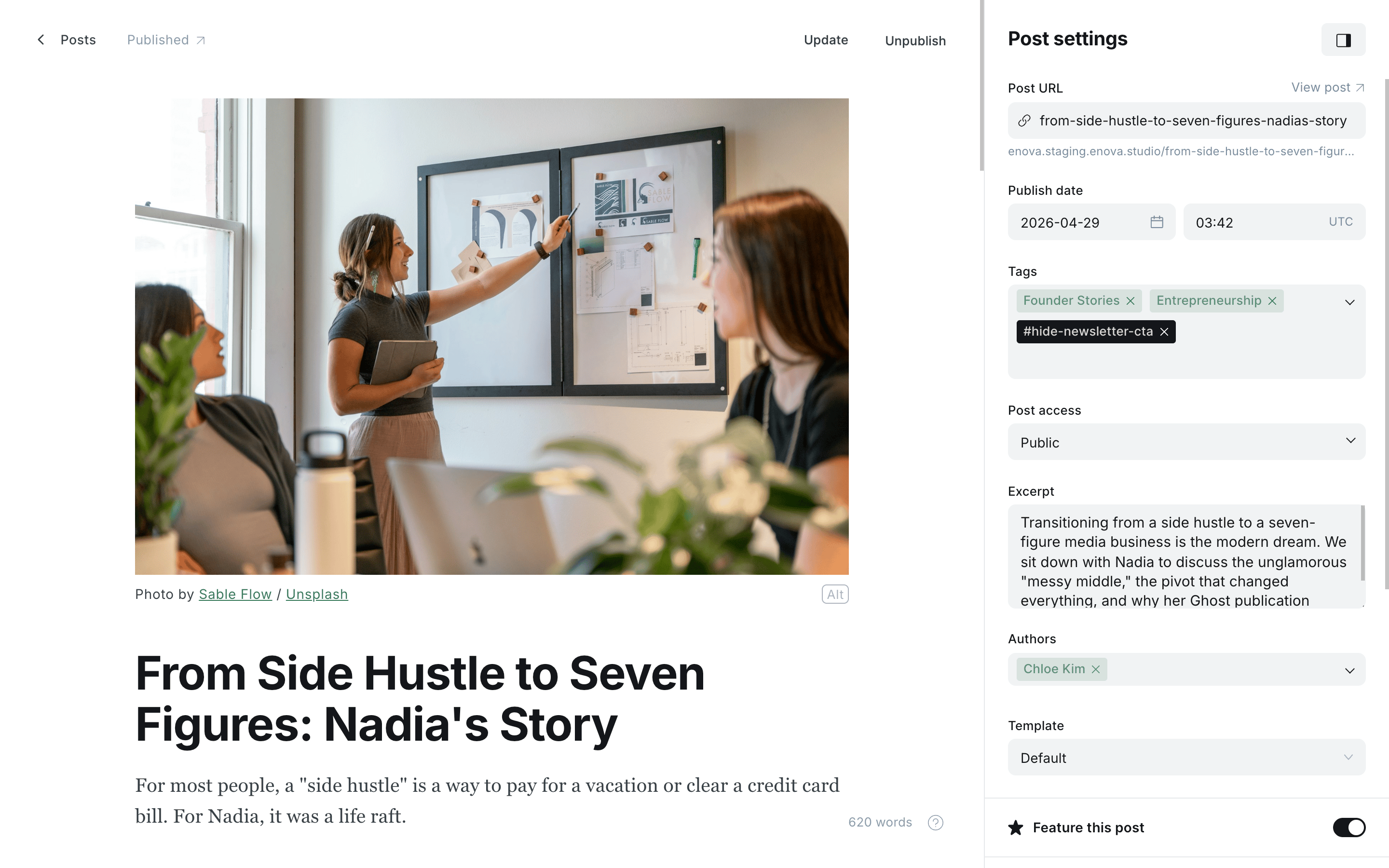
Add the internal tag #hide-newsletter-cta to any post to hide the band there. This is useful on a sponsored piece or an announcement that ends with its own call to action. Internal tags start with # and are never shown to readers; see Editorial conventions for the full list Enova understands.
To switch the feature off across the whole site, unpublish the newsletter-cta page.
Good to know
- No theme settings. Everything lives on the one page, so you can rewrite the band from the editor without touching Design settings.
- It sizes itself to the column. The headline and the signup field respond to the width of the article column, not the browser window, so the band stays correct whether your readers have the sidebars open or closed.
- Edge to edge on phones. The band runs the full width of the screen on mobile, which is what makes it impossible to scroll past.
- Built for keyboards and screen readers. The field has a proper label, the confirmation is announced when it appears, and the hidden form controls leave the tab order.
- It never prints. The band is omitted when a reader prints or saves an article as PDF.
- Styling hooks. The band exposes
[data-component="newsletter-cta"][data-variant="post"]plus parts including[data-part="eyebrow"],[data-part="body"],[data-part="form"]and[data-part="success"]. See the hook reference.
Troubleshooting
The band isn't showing on my posts
Check in this order: the page is published (not draft), its slug is exactly newsletter-cta, membership is enabled in Settings → Access, and you are viewing the post signed out. Members never see the band, so it will be invisible while you are logged in as staff.
It shows on most posts but not one of them
That post either carries the #hide-newsletter-cta tag, or it is a paywalled post you cannot fully read while signed out, in which case the membership prompt takes its place by design.
The headline says 'Subscribe to our newsletter'
That is the fallback used when the page has no title. Give the newsletter-cta page a real title and it becomes the headline.
The label above the headline says 'Newsletter'
That is the fallback used when the page has no public tag. Add one public tag naming your newsletter and it replaces the default. Internal tags starting with # are skipped.
My gallery photos aren't all showing
Only the first row of a gallery is used, up to three images, followed by a "+" badge. This is deliberate: the row is a small avatar strip, not a photo grid.
Tags & Authors Archives
Two directory pages that list every topic you write about and everyone who writes for you, with a letter jump bar, instant search, sorting, and post counts.
Membership Page
A dedicated membership page built from your native Ghost tiers — live prices, benefits, free trials, and one-click Portal checkout, with two layouts and no theme settings to wire up.