Editorial conventions
The internal tags and flags Enova reads to change how a post or page renders. Read this first — these conventions touch most of the other advanced features.
Enova uses a small set of internal tags and Ghost's native Featured flag to change how an individual post or page renders — a different hero layout, a drop cap, a quieter table of contents, and a few more. None of these affect what readers see in your tag archives: internal tags (those whose name starts with #) are Ghost-internal by convention and never appear on public tag pages or in reader-facing chrome.
This page is the single reference for every Enova-specific tag. Where a feature has its own deeper guide — video posts, the table of contents — you'll find the full behaviour there and a quick summary here, so this stays the one place to scan "what can I put on a post, and what does it do?"
Internal tags don't show up on public archives
Ghost treats tags whose name starts with # as internal — they exist for editorial workflow but are hidden from tag archive pages, the public tag list, and reader-facing post chrome. They still trigger theme behaviour, which is exactly what we want for these. Add them in Post settings → Tags the same way you'd add any tag.
Post hero layouts
Every post opens with the default centered header — kicker, headline, excerpt, byline, and the feature image below. You can give an individual post a different hero by adding one internal tag. The layouts are opt-in, per post, and mutually exclusive — pick one.
One hero tag per post — and they're for posts only
If a post carries more than one hero tag, Enova uses the first match in this order: #video › #hero-split-right › #hero-split-left › #hero-cinematic › #hero-immersive, then falls back to the default header. Hero layouts apply to posts; pages always use the centered header (pages can still use #dropcap). The four image-based layouts need a feature image — without one, the post quietly reverts to the default header, so there's never a broken hero.
Video hero
#videoTag a post #video to turn it into a video post: Enova hoists the first uploaded video, YouTube, or Vimeo embed from the post body into a click-to-play hero above the headline, and docks a mini-player in the corner so readers keep watching as they scroll. It takes precedence over the other hero tags. Feed cards for the post pick up a ▶ play badge automatically.
Split hero, image right
#hero-split-rightA magazine-style split hero: the kicker, headline, and excerpt sit on the left, with the feature image as a 4:5 portrait on the right, and the byline strip spanning the full width beneath. The headline uses Enova's serif heading font for a more editorial feel.
The split responds to the width of the article column, not the browser window — so it stays side-by-side on a wide column and stacks neatly (text, then image) when a sidebar is open or on a phone. No setting to tune; it just adapts.
Setup
Open the post in Ghost Admin and set a Feature image (this becomes the portrait).
Open Post settings → Tags and add #hero-split-right.
Update and preview.
Editor: Split right
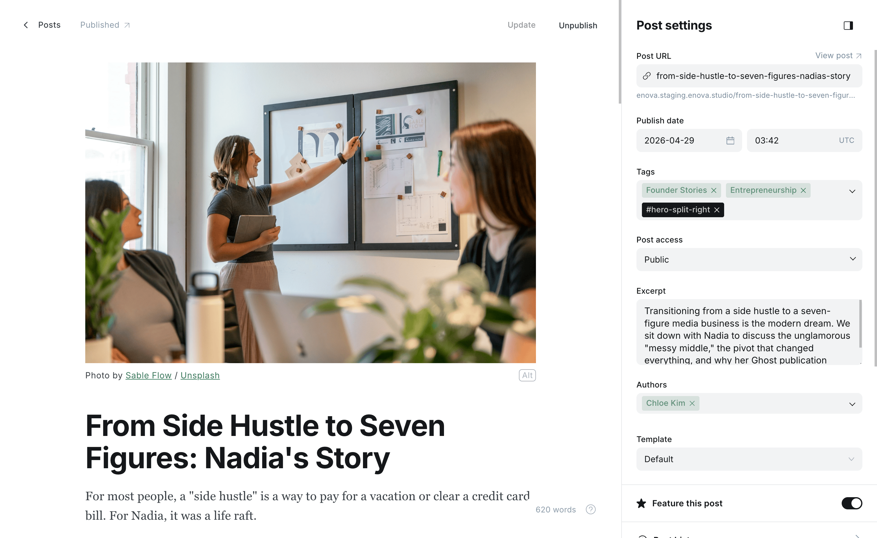
Split right — text left, portrait right
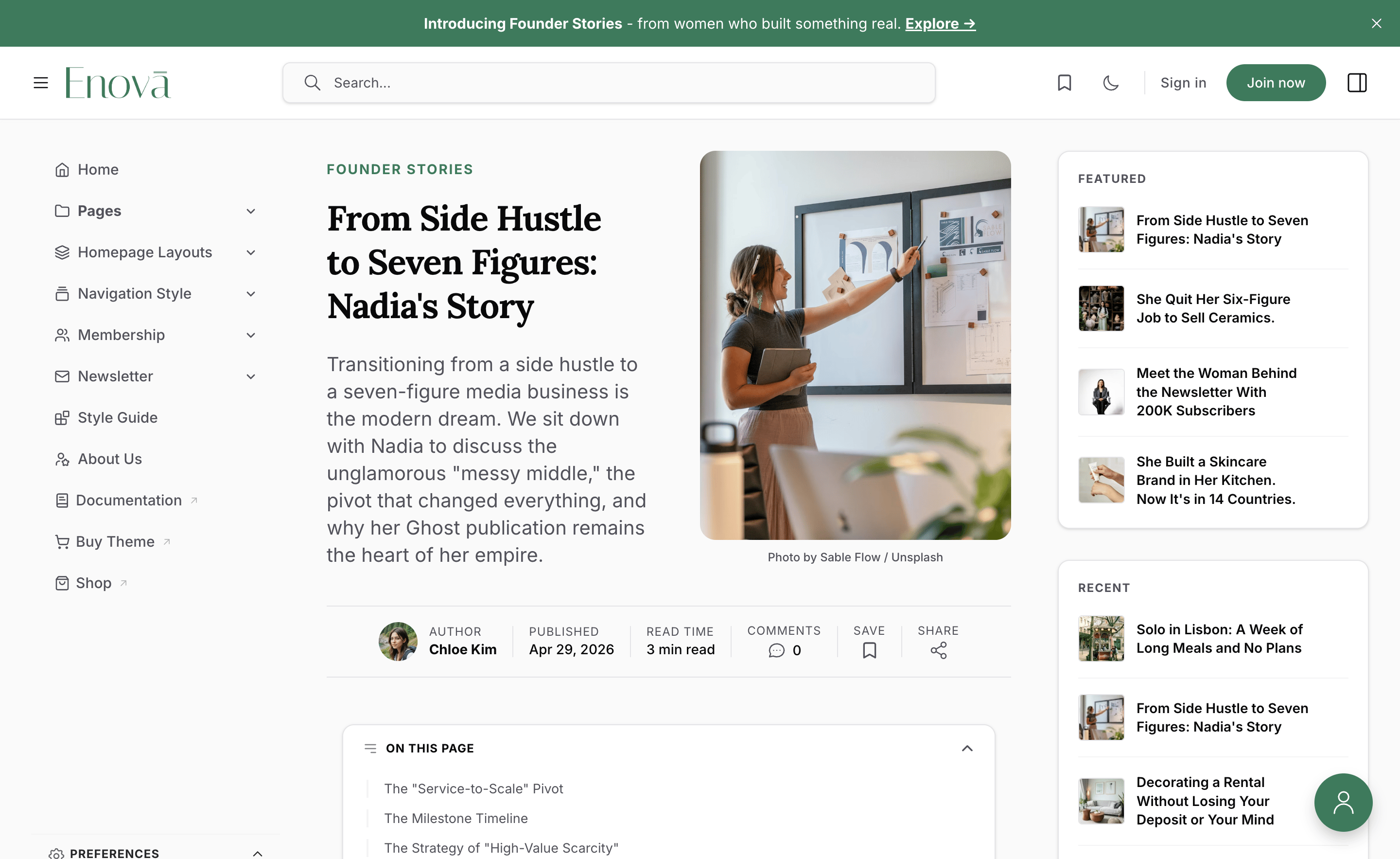
Needs a feature image
Without a feature image there's nothing to place beside the text, so the post falls back to the default centered header. Set one to see the split.
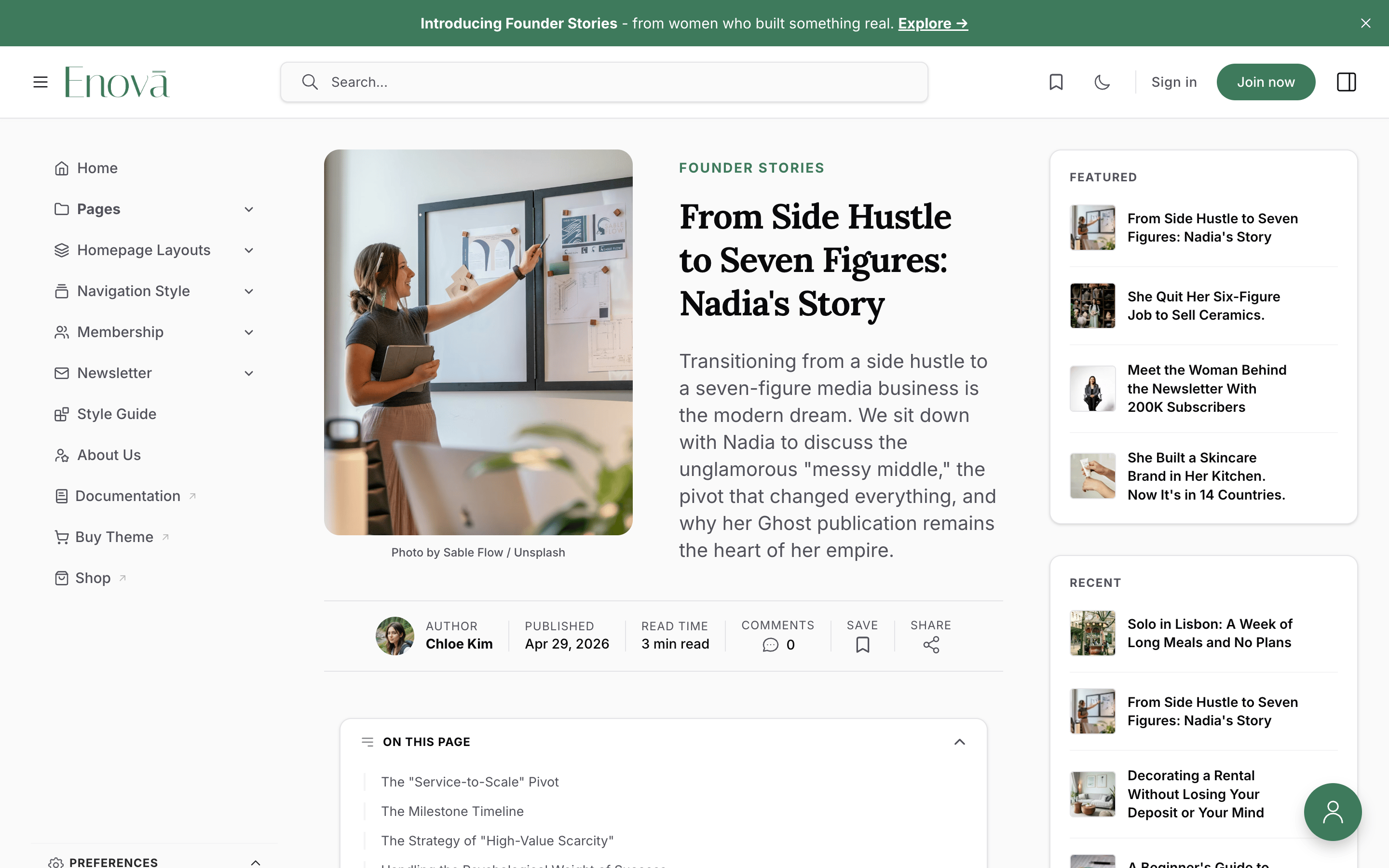
Split hero, image left
#hero-split-leftThe mirror of #hero-split-right: the portrait feature image leads on the left, with the kicker, headline, and excerpt on the right. Everything else — the serif headline, the full-width byline strip, the column-aware stacking (here the image stacks above the text), and the feature-image fallback — behaves exactly as it does for split-right.
Setup
Set a Feature image on the post.
Add the tag #hero-split-left in Post settings → Tags.
Update and preview.
Editor: Split left
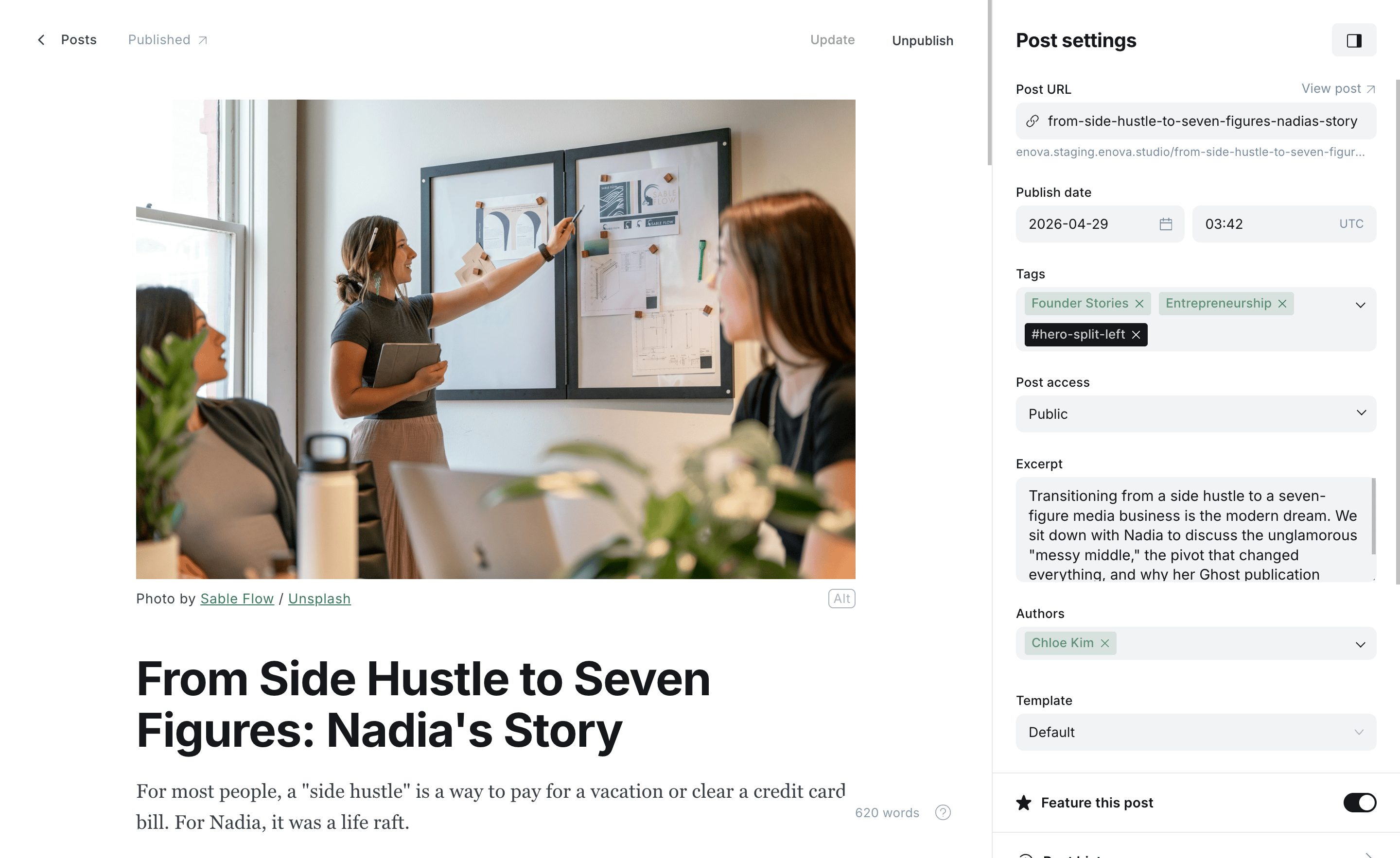
Split left — portrait left, text right
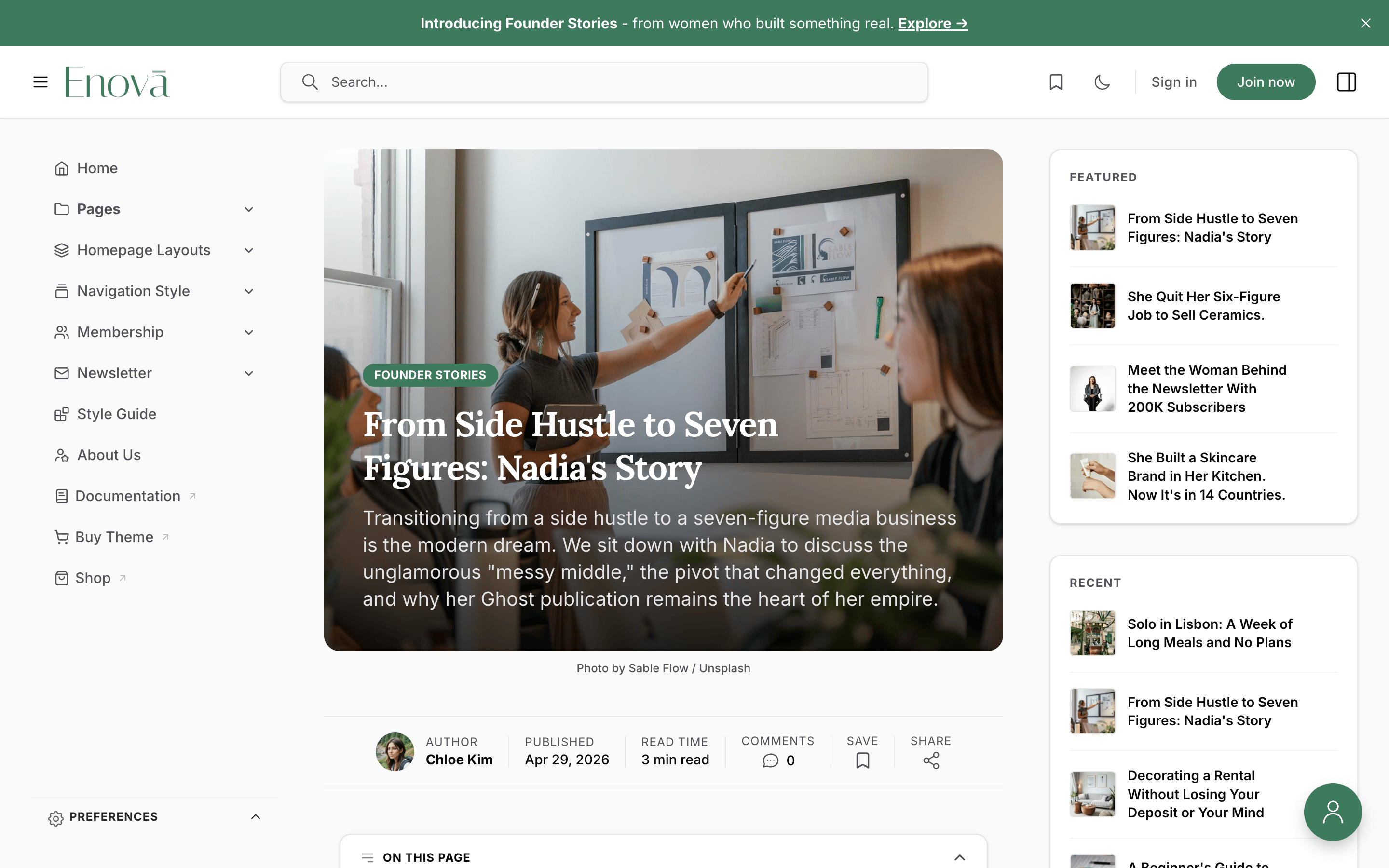
Cinematic hero
#hero-cinematicA full-bleed, immersive hero: the feature image fills the banner with a soft dark gradient across the bottom, and the kicker (as a pill), headline, and excerpt sit overlaid in white over the image. It's the same treatment as the homepage featured carousel, so a cinematic post feels consistent with the front page.
On a narrow article column the excerpt moves below the image instead of overlaying it, so a long summary never hides the photo. The banner is taller than the other heroes (roughly 420px on phones, 520px on desktop).
Setup
Set a strong, wide Feature image — it carries the whole hero, so pick one that reads well with text over it.
Add the tag #hero-cinematic in Post settings → Tags.
Update and preview.
Editor: Cinematic
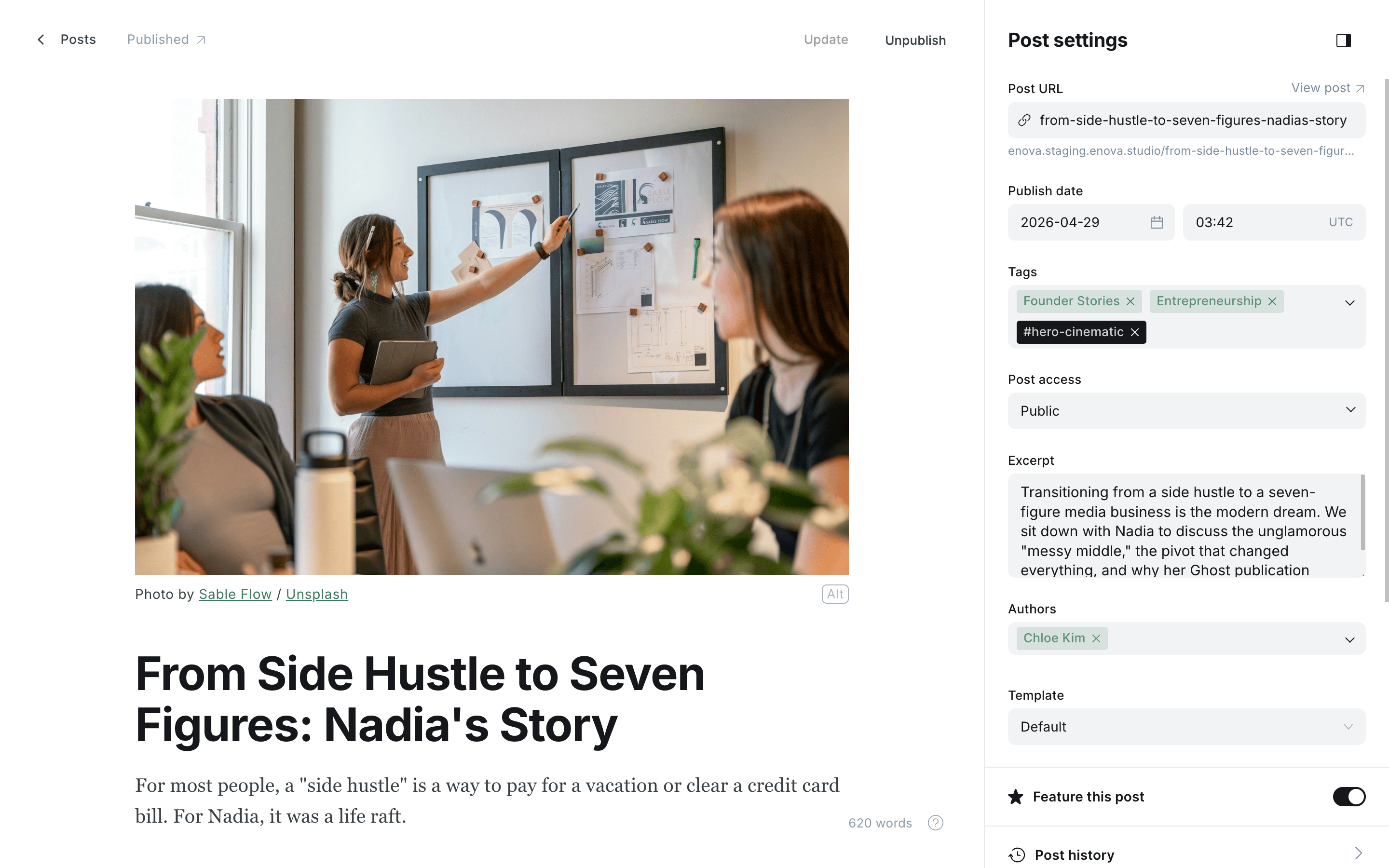
Cinematic — full-bleed image with overlaid title
Needs a feature image
The cinematic hero is the feature image, so a post without one falls back to the default centered header.
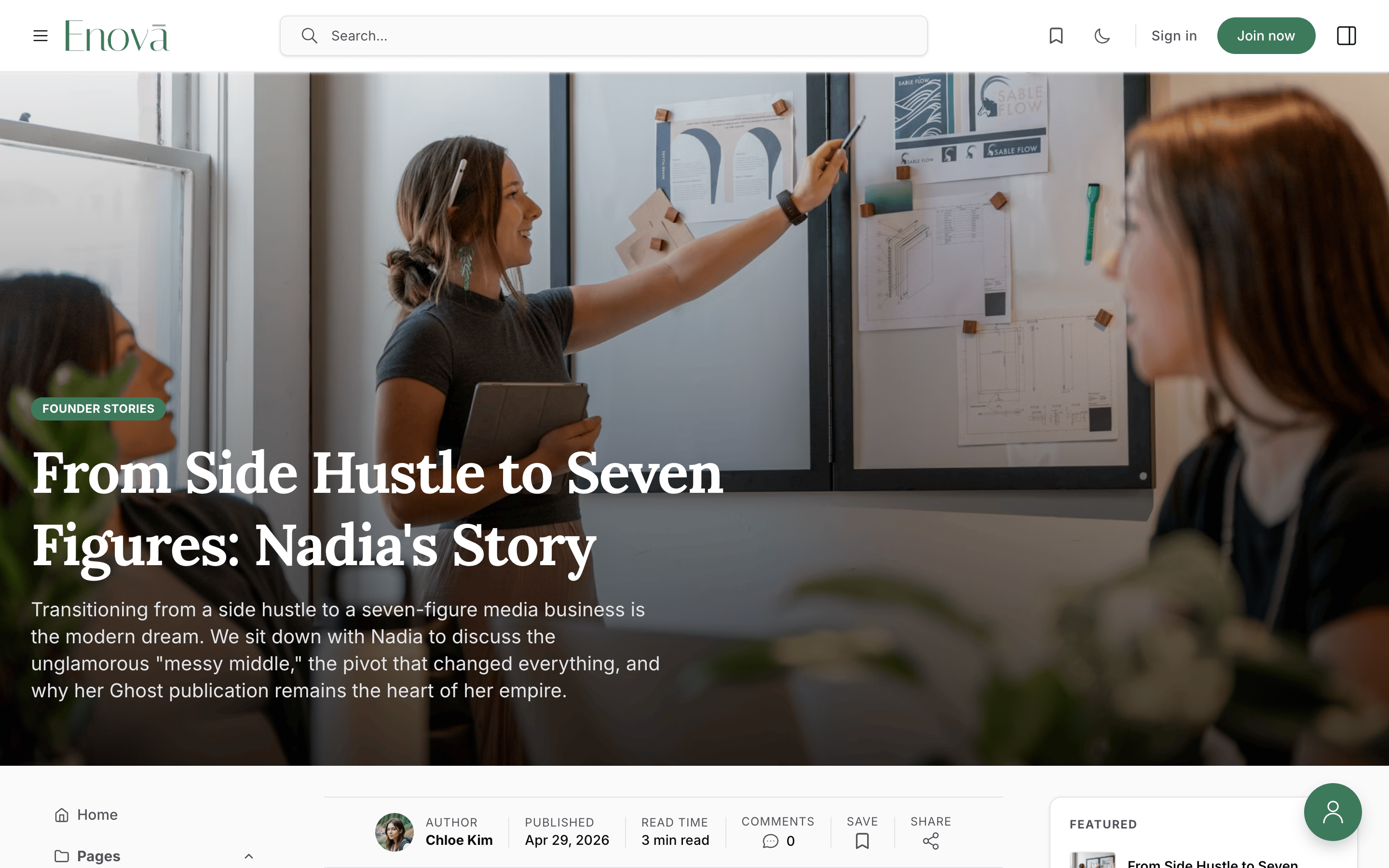
Immersive hero
#hero-immersiveThe most dramatic hero: the feature image spans the full browser width, edge to edge across the top of the page — wider than the cinematic hero, which stays inside the reading column. The kicker, headline, and excerpt sit overlaid in white over a soft dark gradient; the byline strip moves to the top of the article below, and the sidebars and content begin beneath the banner.
Because the image breaks out across the whole window, pick a large, high-resolution feature image — it's shown at full width, so a small or busy photo will look soft. The banner is tall (roughly 80% of the screen height on phones, 90% on desktop).
Setup
Set a wide, high-resolution Feature image — it carries the full-width banner.
Add the tag #hero-immersive in Post settings → Tags.
Update and preview.
Editor: Immersive
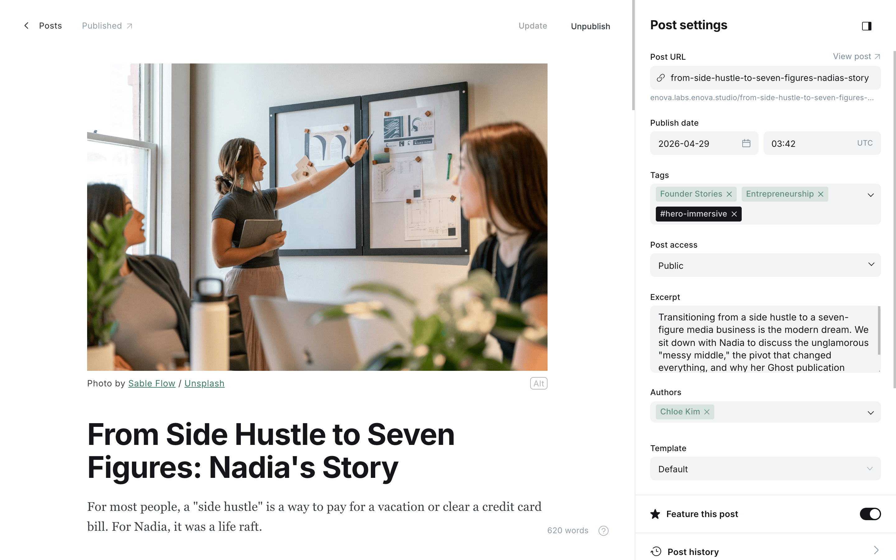
Immersive — full-browser-width image with overlaid title
Needs a feature image
The immersive hero is the feature image, so a post without one falls back to the default centered header.
The default header
No tag needed. Posts without a hero tag (and every post that opts in but has no feature image) render the centered header — kicker, headline, excerpt, and byline centered above the feature image — with the headline in Enova's sans-serif. This is the right choice for most stories; reserve the split and cinematic layouts for features where the image deserves the spotlight.
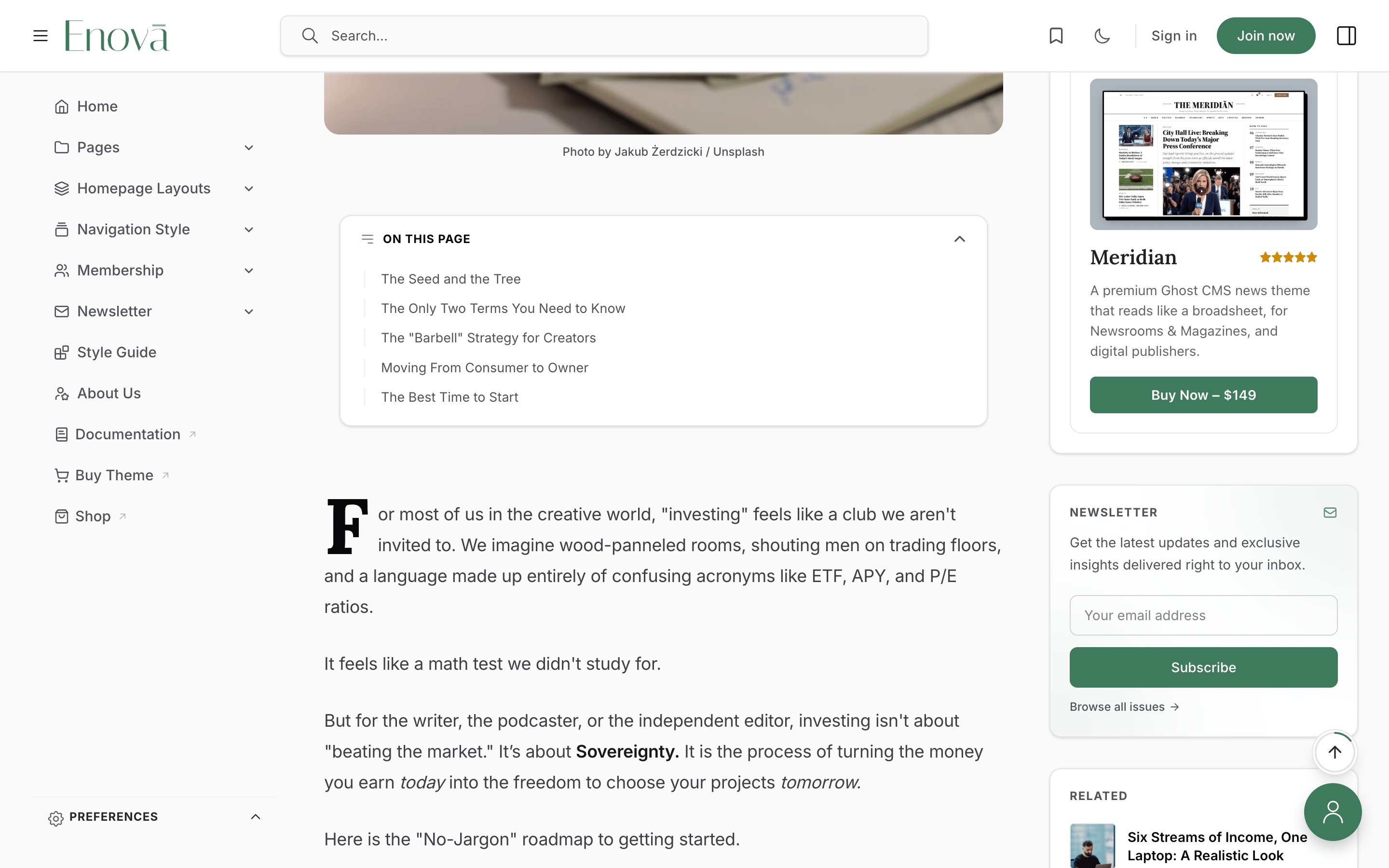
Drop cap
#dropcapTag a post or page #dropcap to open it with an elegant oversized initial on the first paragraph. The drop cap uses your heading font and ink colour, scales with the reader's font-size control, and adapts to dark mode automatically — no styling required.
It renders only when the article actually starts with a paragraph. A post that opens with an image, a heading, a quote, or any other card is left untouched, so a drop cap is never stranded mid-article.
Setup
Open the post or page in Ghost Admin.
Confirm the body begins with a normal paragraph (not an image or heading).
Add the tag #dropcap in Post settings → Tags, then update.
Editor: Drop cap
Drop cap on the lead paragraph
Want it bigger, or a different colour?
The drop cap is fully restylable from Code injection via the [data-region="post-body"][data-variant="dropcap"] hook (the styling lives on the ::first-letter of the lead paragraph).
Table of contents
Enova builds an adaptive table of contents for long reads: an inline list at the top of the article that hands off to a sticky list in the right sidebar as the reader scrolls. It's on by default and needs no tag to appear. Three internal tags let you switch it off — per post or page — when a piece reads better without it.
Full guide: Table of Contents →| Tag | Effect | Applies to |
|---|---|---|
#disable-toc | Hides both the inline and sidebar TOC | Posts & pages |
#disable-inline-toc | Hides only the inline TOC (keeps the sidebar TOC) | Posts |
#disable-sidebar-toc | Hides only the sidebar TOC (keeps the inline TOC) | Posts & pages |
Scope note
The inline TOC appears on posts only, so #disable-inline-toc has nothing to act on when used on a page. The sidebar TOC appears on both posts and pages.
#disable-toc wins
If #disable-toc is present, both lists are hidden regardless of the other two tags.
Text-only newsletter cards
#disable-newsletter-card-imagesFor a text-forward newsletter archive without thumbnails, add this tag to your Newsletters page — the Ghost page bound to /newsletters/ — not to individual issues. The List and Magazine archive layouts then render each card as title, date, excerpt, and meta, with the image column removed.
Widgets & promotions
These tags don't change how an article looks — they control where Enova's promotional widgets appear. Each widget has its own guide covering setup, content, and styling; the entries below are the quick reference.
Donate widget
#display-donate-widgetThe reader-funded Donate widget shows on the homepage automatically. Add #display-donate-widget to any post or page to surface it there too, in the right sidebar alongside the article. Its content always comes from your single donate page — this tag only controls where it appears.
Donate author avatars
#display-authorsA companion tag for the Donate widget: add #display-authors to your donate page (not to posts) to show a stack of author avatars above the widget's pitch. The avatars come from the donate page's assigned authors.
Sponsor logo wall
#display-sponsors-widgetThe sponsor logo wall shows on the homepage automatically. Add #display-sponsors-widget to any post or page to surface it there too, in the right sidebar. Its content always comes from your single sponsors page — this tag only controls where it appears.
Hide the house ad
#no-adsThe house ad (your self-promotional sidebar card) shows across your whole site by default. Add #no-ads to any post or page to suppress it there — handy on a sponsored article or anywhere a house promo would feel out of place. It keeps showing everywhere else.
Membership page layout
#compact-tier-pickerAdd #compact-tier-picker to your join page (the membership page) to switch its plans from the default comparison grid to a conversion-focused "Join" card — a plan picker with a live order summary. Both layouts read the same Ghost tiers; the tag only changes the presentation.
Hide the About widget
#hide-from-sidebarEnova's homepage sidebar opens with an About widget built from your about page (its icon, title, excerpt, and social links). To suppress that widget, add #hide-from-sidebar to the About page itself. Note this also hides any custom social links you added through Code injection — they live inside the widget.
The Featured flag
Ghost has a built-in Featured toggle on every post (in the Post Settings panel — it's a flag, not a tag). Enova surfaces featured posts in three places:
- Homepage hero carousel — when you set the homepage hero to Featured posts, the banner cycles your most recent featured posts (up to 6). See Hero Section.
- Sidebar Featured widget — the right sidebar lists your 4 most recent featured posts. See Featured Posts widget.
- Card badge — featured posts wear a small Featured label in the feed.
Flip the Featured toggle on a post and it flows into all three automatically; turn it off and the post drops out on the next load.
Visibility & paywall
Enova honours every Ghost visibility tier (public, members, paid, specific tiers). On a story a reader can't fully access, the article ends with a member call-to-action instead of the rest of the content:
- Logged-out readers see a sign-up prompt.
- Logged-in readers who need a higher tier see an upgrade prompt.
In feeds, posts the reader can't open render as locked cards so the gating is clear before they click. There's no separate "visibility chip" on the hero — the member CTA and the locked card carry the message.
Styling and wording
Restyle the CTA from Code injection via the [data-component="member-cta"] hook ([data-variant="signup"] and [data-variant="upgrade"]). The wording is localized through Ghost's locale files — see Publication language.
Social Links
Add social links to Enova — nine native Ghost social accounts, plus any extra platform via simple meta tags in Code Injection.
Right Sidebar
Every widget in Enova's right sidebar — About, Featured, Recent, Popular Tags, Top Authors, Newsletter, Recommendations, Related, TOC, ads, and Donate.