Navigation
Set up Signal's menus in Ghost — dash-prefixed sub-items for dropdowns, external-link arrows, the inline "More" overflow, the hamburger-menu drawer, and hash-prefixed footer columns.
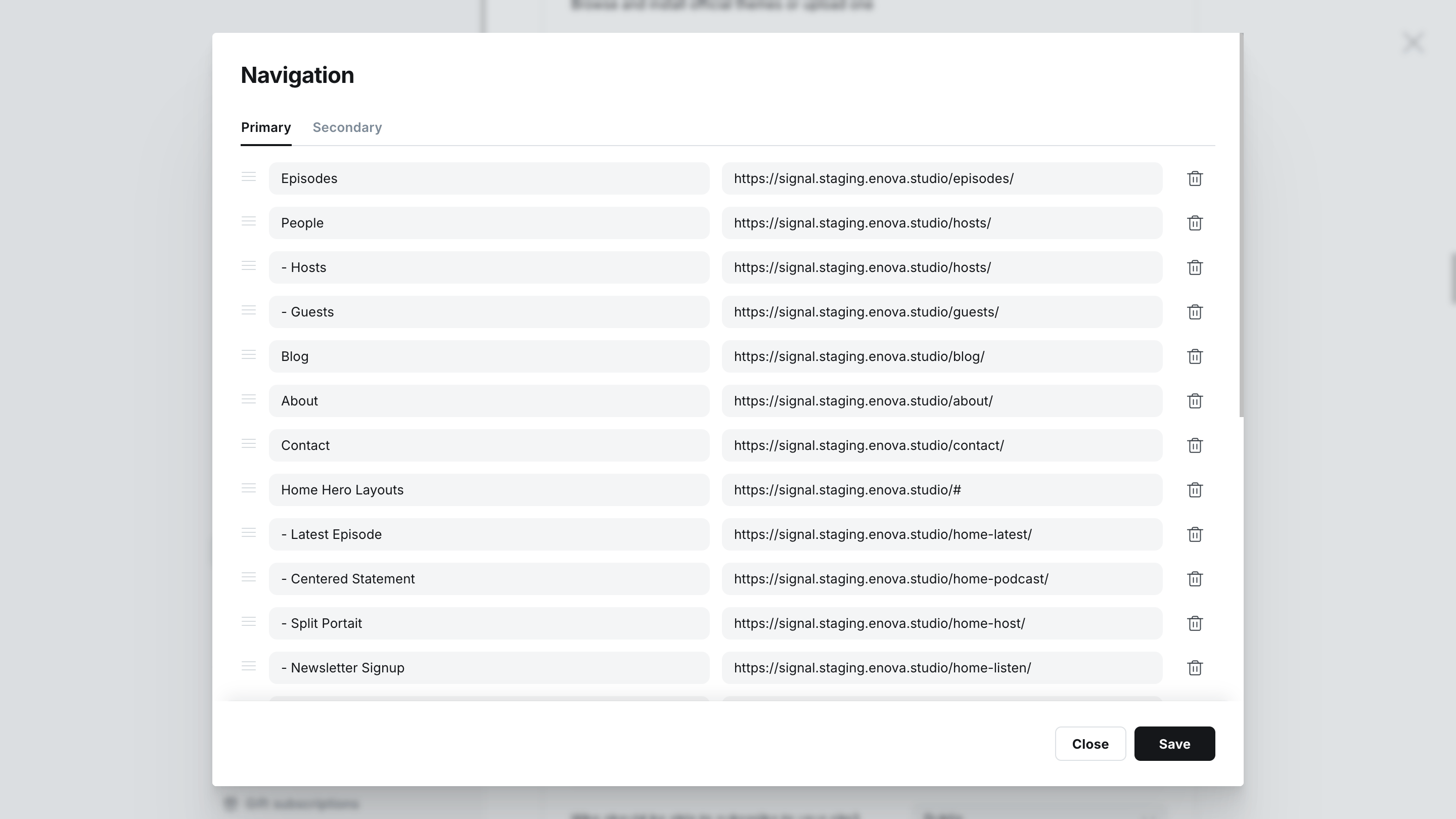
Signal builds its header and footer menus from Ghost's two native navigation lists — Primary and Secondary — in Settings → Navigation. You add plain links there, and Signal turns them into dropdowns, an overflow menu, a mobile drawer, and footer columns automatically. No code injection or extra configuration is needed.
Choose your layout
Whether the desktop menu shows as centered inline links or behind a hamburger button is set once with the Navigation style setting. See Navigation style, then come back here for the menu content itself.
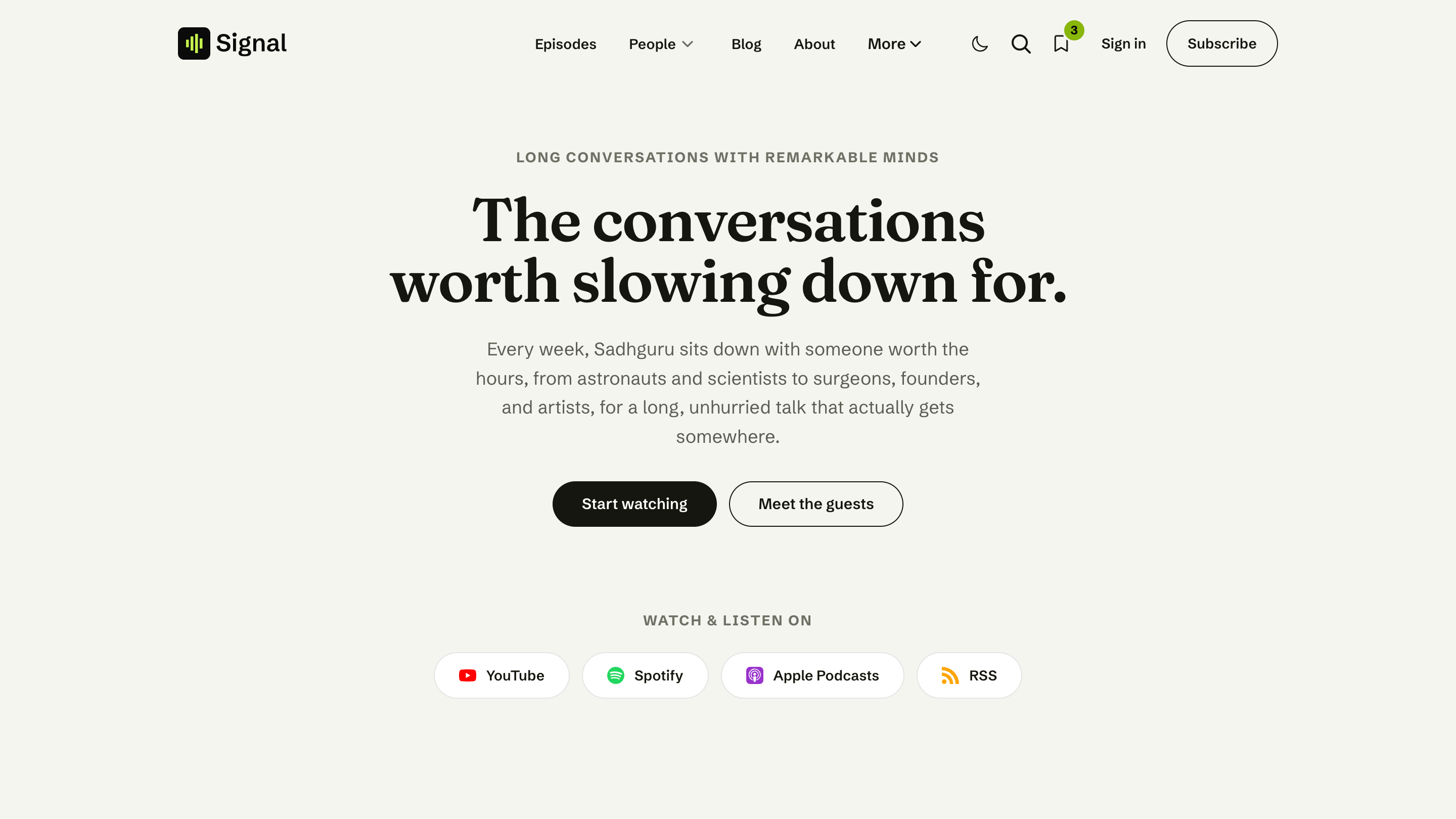
Primary navigation
The Primary navigation is the main menu in your site header.
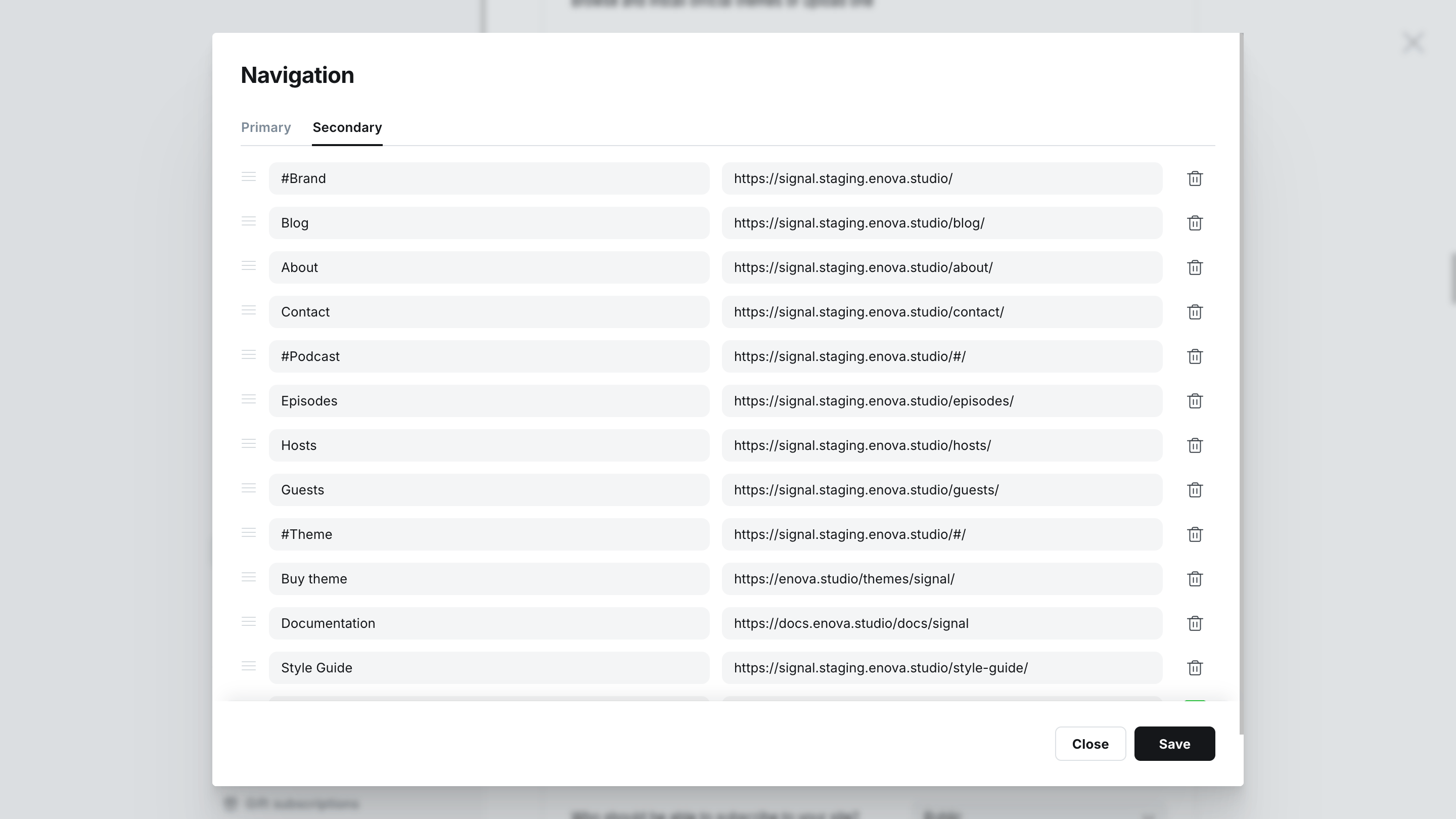
Navigate to Settings → Navigation in Ghost Admin.
In the Primary navigation section, add a label and URL for each menu item. Drag to reorder.
Links that point to another website open in a new tab and show a small outbound arrow (↗) automatically — you don't mark them as external.
Click Save.
In Ghost Admin
On your site
Multi-level dropdowns
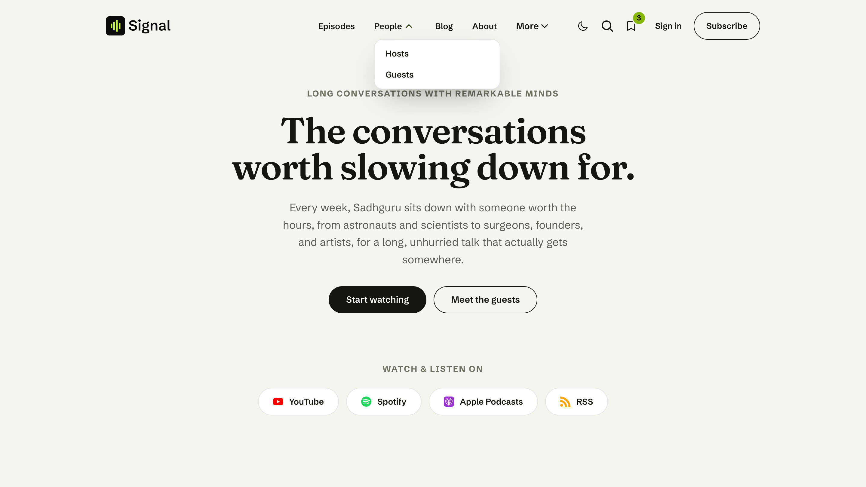
Signal supports a second level of menu items, shown as a dropdown on desktop and an expandable group on mobile.
To turn an item into a sub-item, start its label with a dash (-). Every dash-prefixed item attaches to the closest normal item above it, and Signal strips the dash before displaying the label:
| Label in Ghost | Becomes |
|---|---|
People | A top-level menu item |
- Hosts | A sub-item under People, shown as "Hosts" |
- Guests | A second sub-item under People |
About | The next top-level item |
The top-level item with children becomes a dropdown toggle; its sub-items appear in the panel beneath it.
No code required
That dash prefix is the whole setup — sub-menus are built entirely in Ghost's native navigation editor. Signal supports two levels (a top item and its sub-items); deeper nesting isn't shown.
Inline and Hamburger layouts
The Navigation style setting controls how the desktop menu is presented.
Inline (default)
Menu links sit centered in the header, aligned with the content below.
Hamburger
The menu is tucked behind a button at every width, opening the drawer.
The "More" overflow
In Inline mode, if the header doesn't have enough room to fit every menu item on one line, Signal automatically tucks the trailing items into a More dropdown so the header stays clean. As the window resizes — or after your fonts and logo load — items move in and out of More to fit. Sub-items keep their grouping inside the More panel.
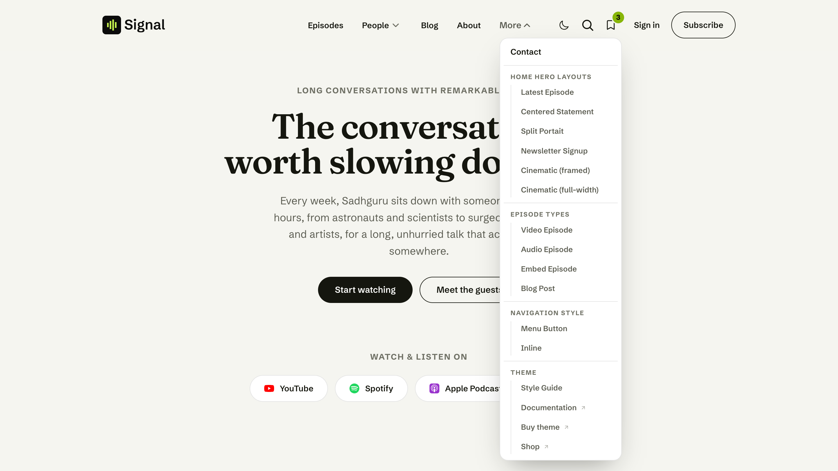
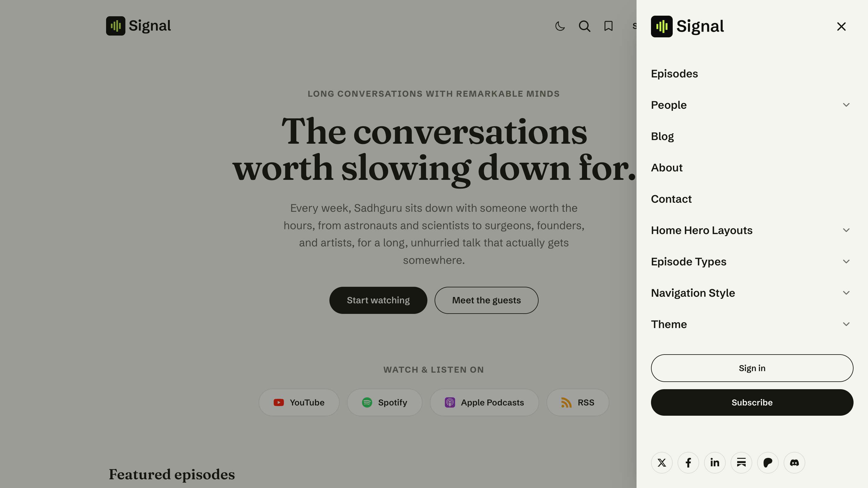
Hamburger mode
In Hamburger mode, the inline menu is hidden at all widths and the entire menu lives behind the hamburger button, opening the same drawer used on mobile. This suits longer menus or a more minimal header.
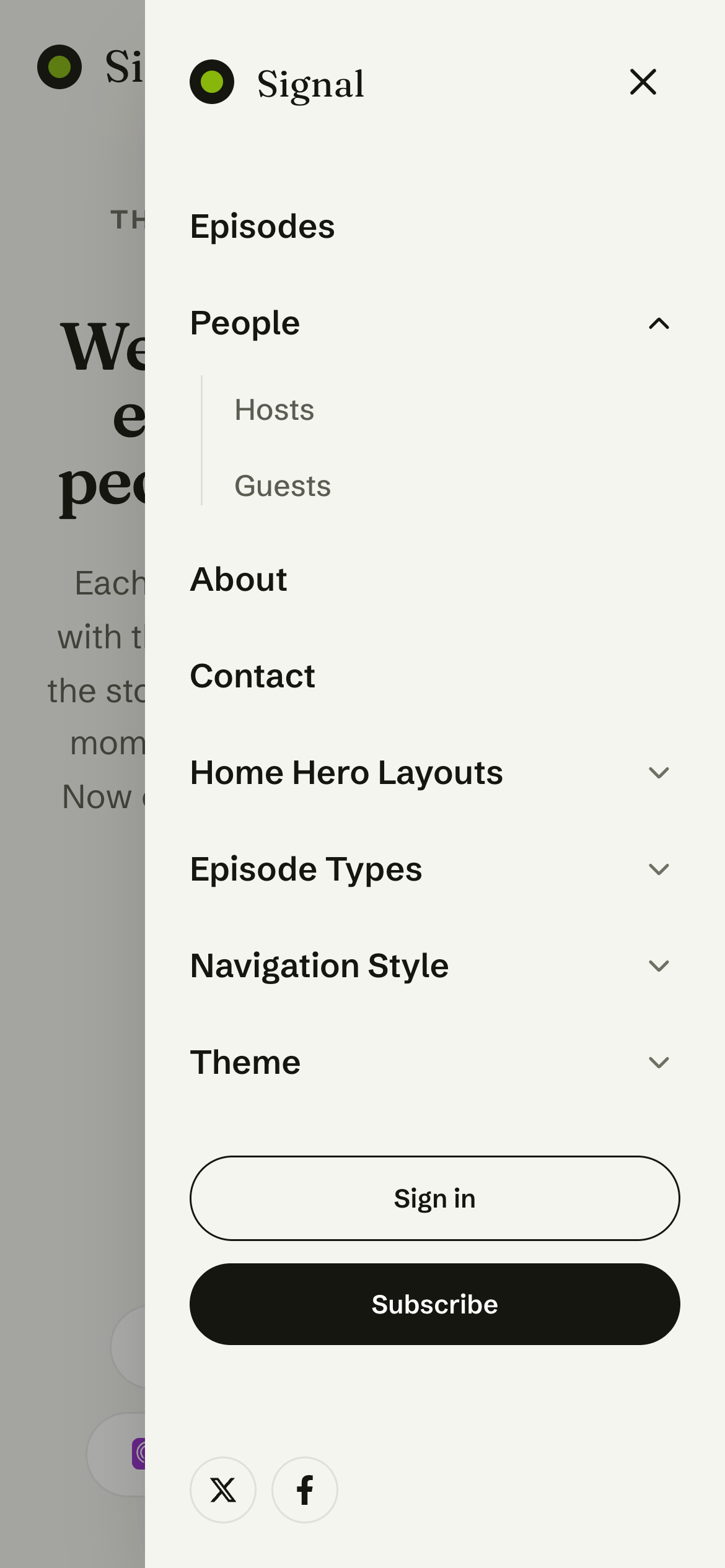
On phones and tablets
Below the desktop breakpoint, the menu always collapses to a slide-out drawer opened from the hamburger button — regardless of which navigation style you chose. Inside the drawer:
- Top-level items with sub-items become expandable groups; tap to open. The group containing the current page is expanded for you.
- The drawer also holds your member buttons (Sign in / Subscribe, or Account) and social links.
Mobile drawer
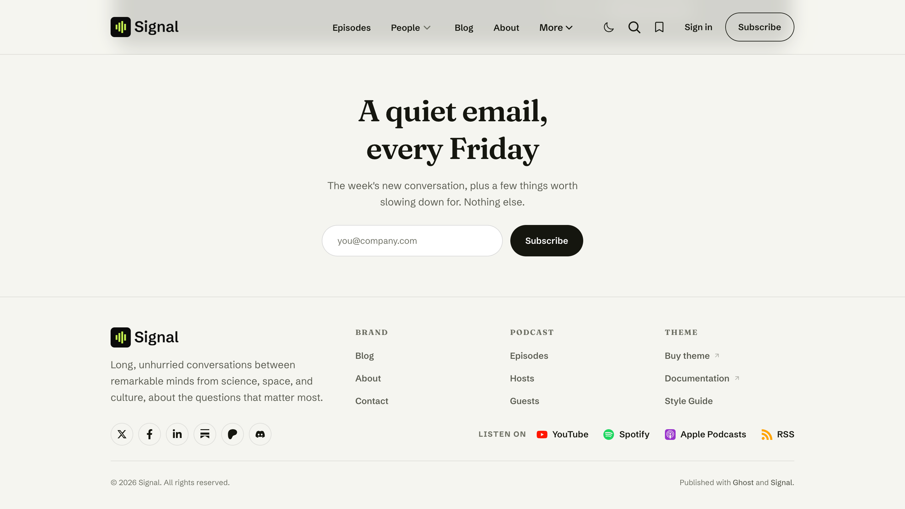
Secondary navigation (footer)
The Secondary navigation list drives the footer. Add links to it the same way, in Settings → Navigation → Secondary navigation.
Basic links
With plain links and no headings, the footer groups them under a single Quick Links column.
Grouped columns
To split the footer into columns, prefix a label with a hash (#) to create a column heading. Every link after a # heading is grouped under that column, until the next heading:
| Label in Ghost | Becomes |
|---|---|
#Show | A column titled "Show" |
Episodes | A link in the Show column |
Guests | A link in the Show column |
#Follow | A second column titled "Follow" |
RSS | A link in the Follow column |
Signal lays the footer out in titled columns, adapting the count to how many # headings you add. Your brand block, social icons, and the "Listen on" platform links sit alongside the columns automatically.
The dash (-) sub-item convention is for the primary menu's dropdowns. In the footer, use # headings for columns — sub-items aren't nested there.
In Ghost Admin
On your site
Accessibility & interaction
- Keyboard friendly: dropdowns open with Enter or ↓, close with Esc, and only one is open at a time.
- Current page: the active item is highlighted — even when it sits inside More.
- The drawer locks page scrolling while open, closes on Esc or a tap outside, and returns focus to the menu button.
Related
- Navigation style — switch the desktop menu between inline links and a hamburger button.
- Social links — the icons shown in the footer and mobile drawer.